


Editorial environments and mobile prototypes, built to be revisited.
Partnership microsites that replaced the boardroom. Editorial platforms that carried a mission for fifteen years. Mobile interaction systems where the wait becomes ceremony — assembled with Claude as a parsing and scaffolding partner so each prototype ships as a demonstrable spec, ready to fork on day one. Built around specific stories, specific audiences, specific outcomes.
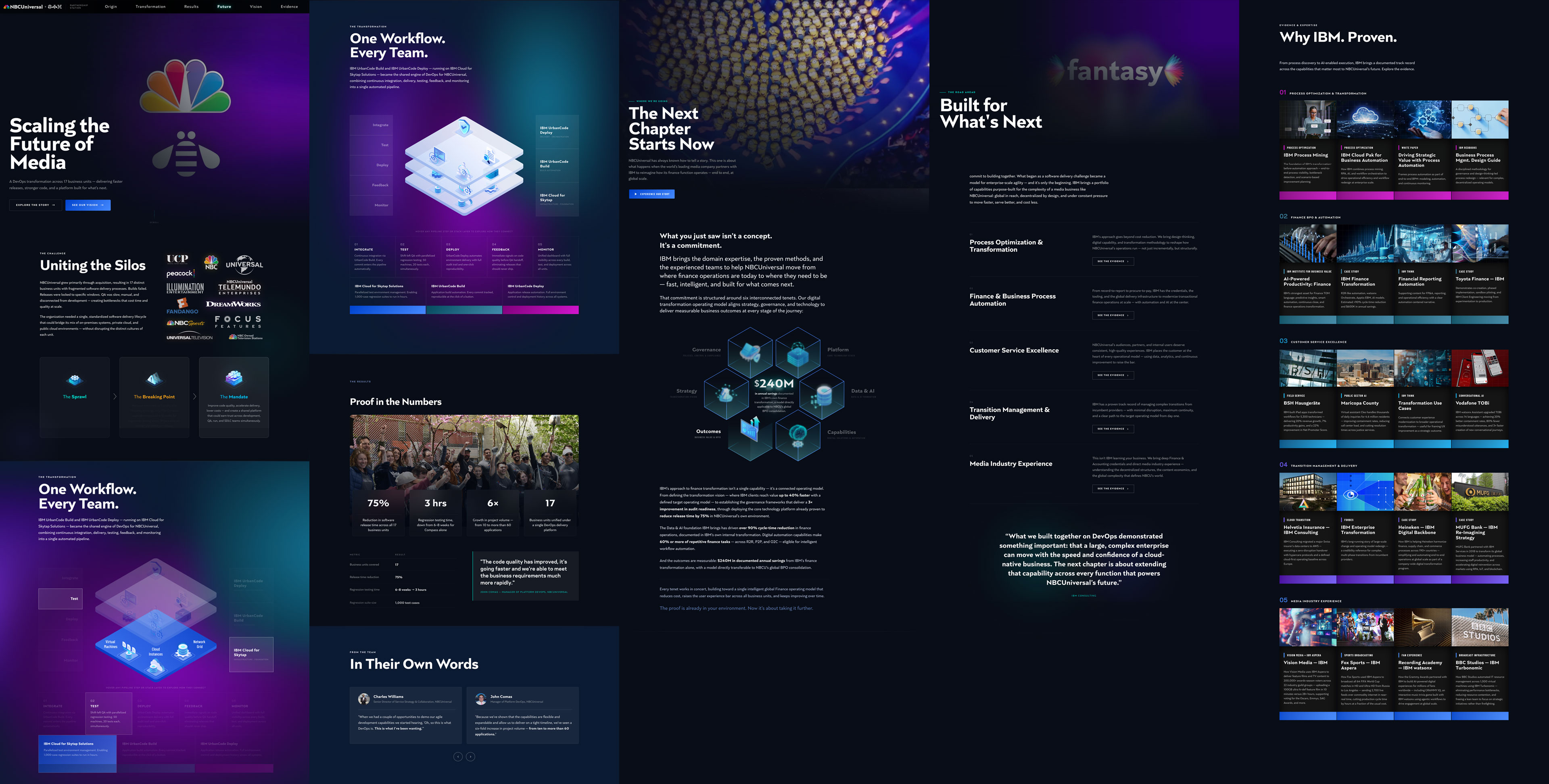
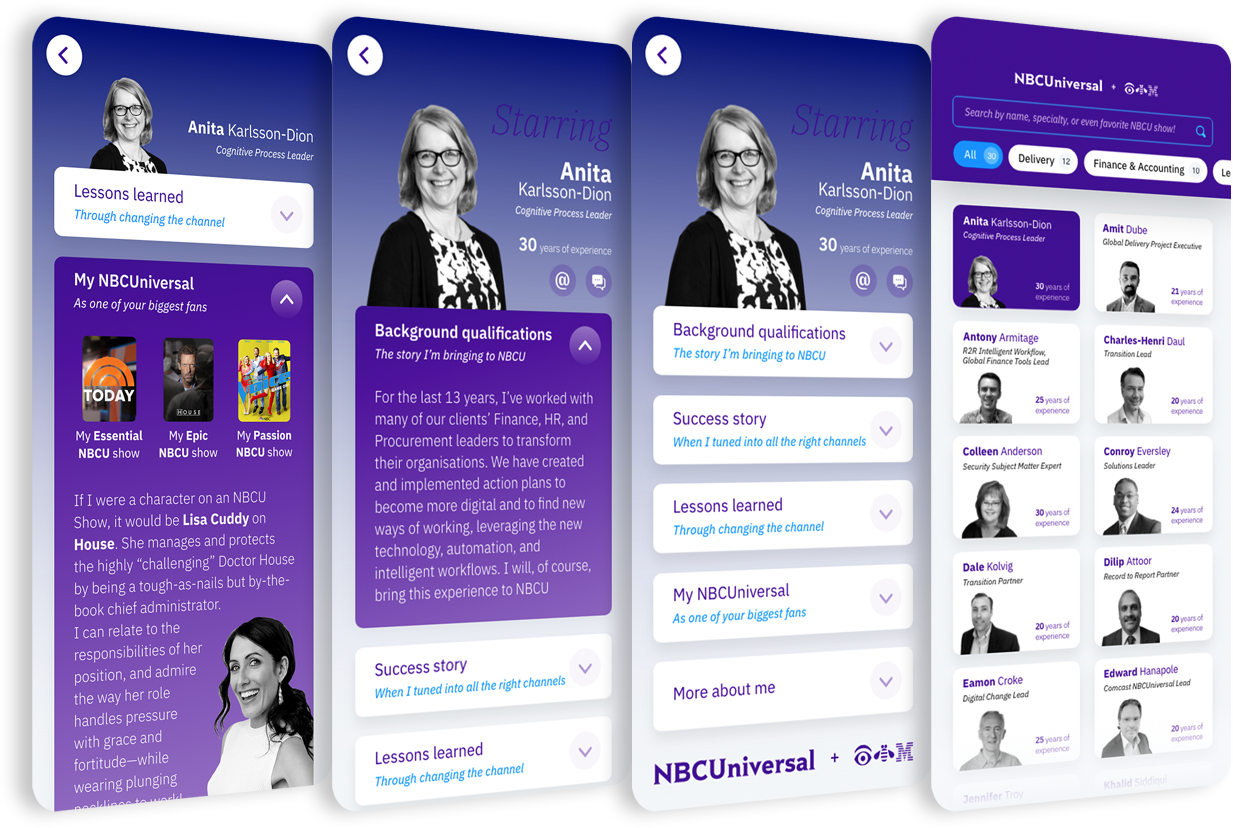
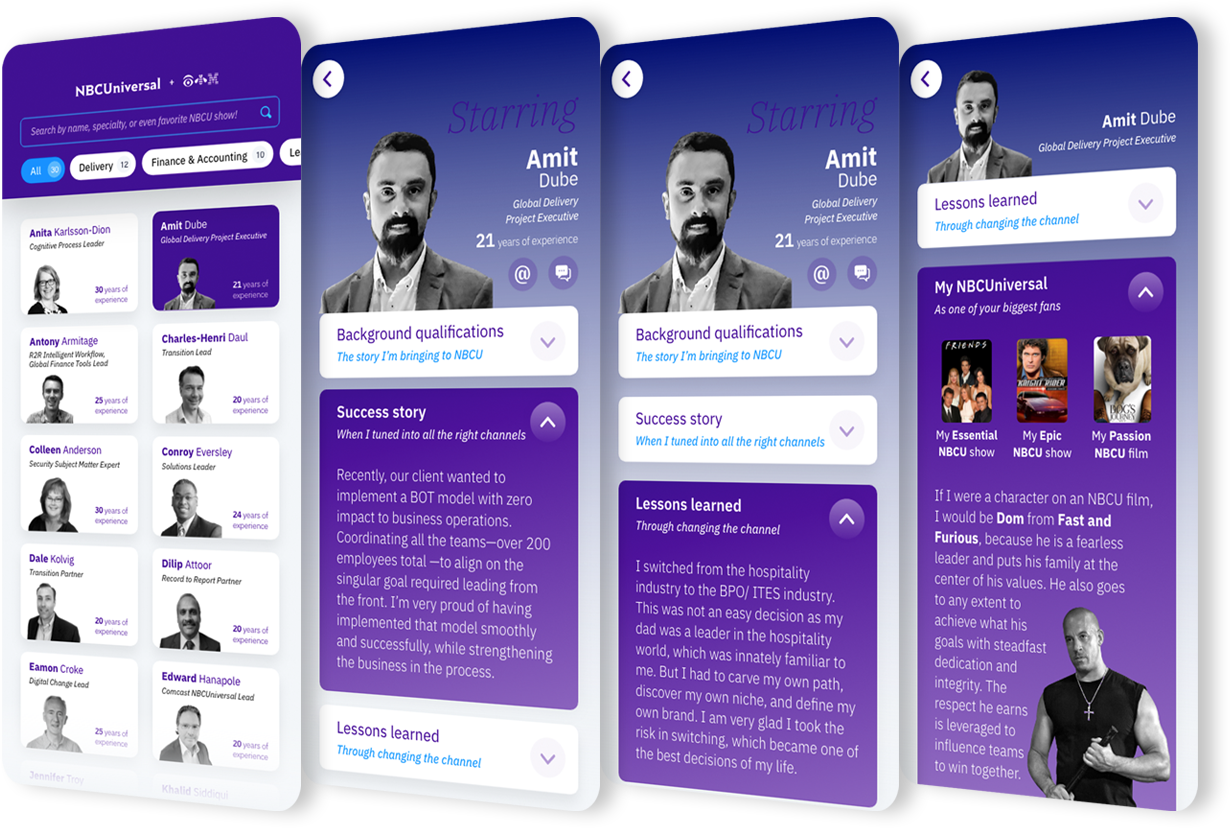
April 2020. The world had just shut down, and a major partnership engagement needed to land — without a single in-person meeting. The answer was a fully bespoke microsite built to replace the boardroom: a living, scrollable environment where IBM’s case for transforming NBCUniversal’s global finance function could unfold at the client’s pace, on their terms, across any device.
The site wove together a custom brand identity, executive video content, data-driven proof points, personalized team bios, and interactive storytelling — all in one cohesive digital experience.
A destination built to be explored.
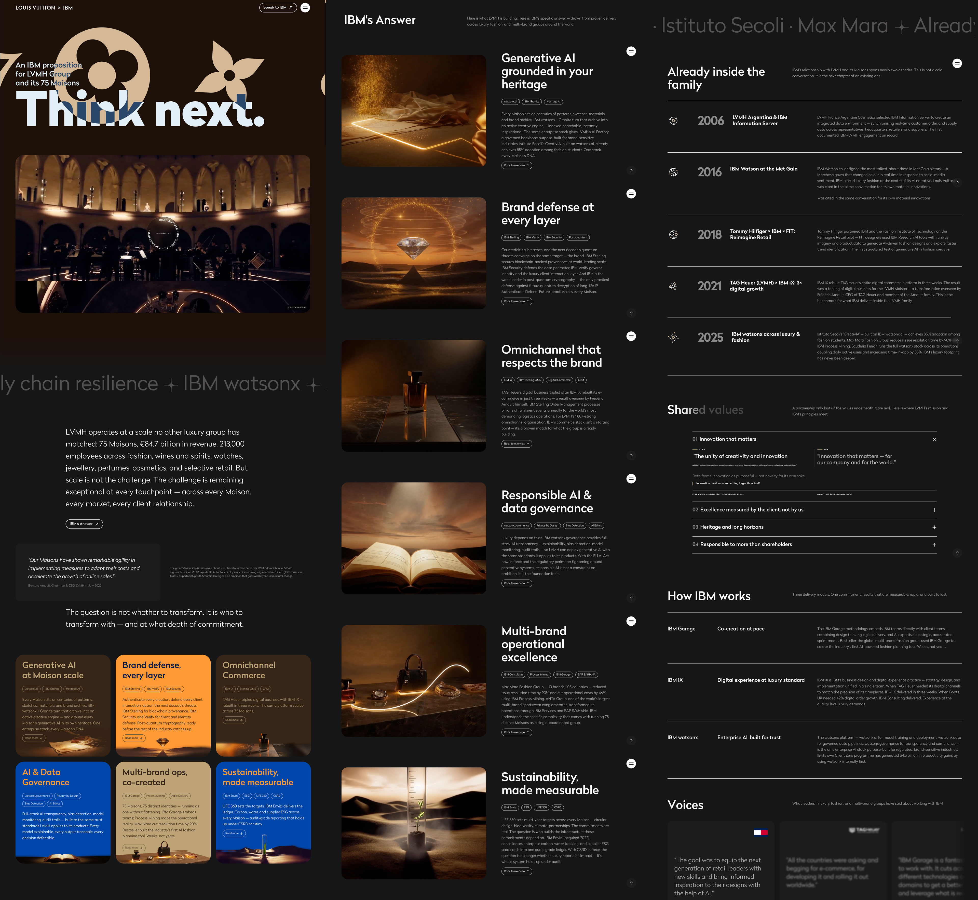
75 Maisons. €84.7 billion in revenue. The world’s most recognized luxury brand remains an open invitation. The proposition for Louis Vuitton was built as a living, scrollable environment — one that holds IBM’s case for partnership in editorial form, with the same care for typography, motion, and craft that the brand itself applies to its objects.
Six capability cards anchored in verified Maison case studies. A shared-values accordion grounded in real LVMH and IBM published statements. Voices from the wider luxury family. A timeline of IBM’s track record across the group. All designed for exploration at the reader’s pace — and to last past the meeting.
An environment built to outlast the meeting — opened again, weeks later, and still holding up.
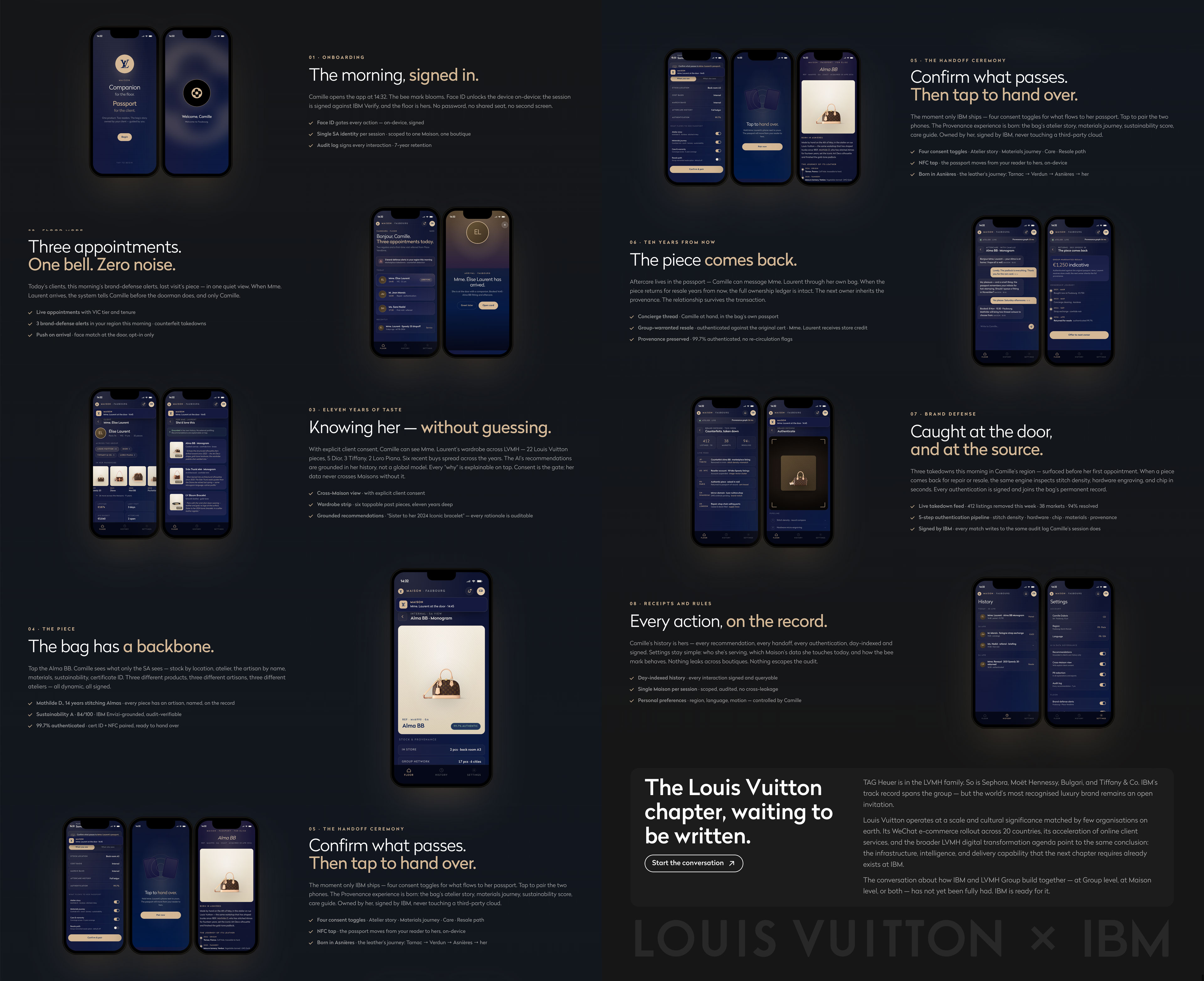
Inside a Louis Vuitton boutique, the sales associate is the Maison. The bag is the artifact. Anything between them — a tablet, a screen, an app — risks breaking the spell of service. The challenge: design a tool the associate actually wants to hold, one that elevates the encounter at every turn.
Maison is a 16-screen mobile interaction system that walks one associate through one client’s day — morning sign-in, recommendation, handoff, authentication, aftercare — turning the moments software usually interrupts into ceremonies the associate can hold in one hand. Authenticating a returning piece is the longest ritual: a viewfinder, a cream beam easing across the bag, a four-step provenance check running underneath. The wait — usually a spinner — is hidden inside the choreography itself; perceived latency, dissolved into ceremony.
Service, rendered in motion.
Every transition tuned by feel.
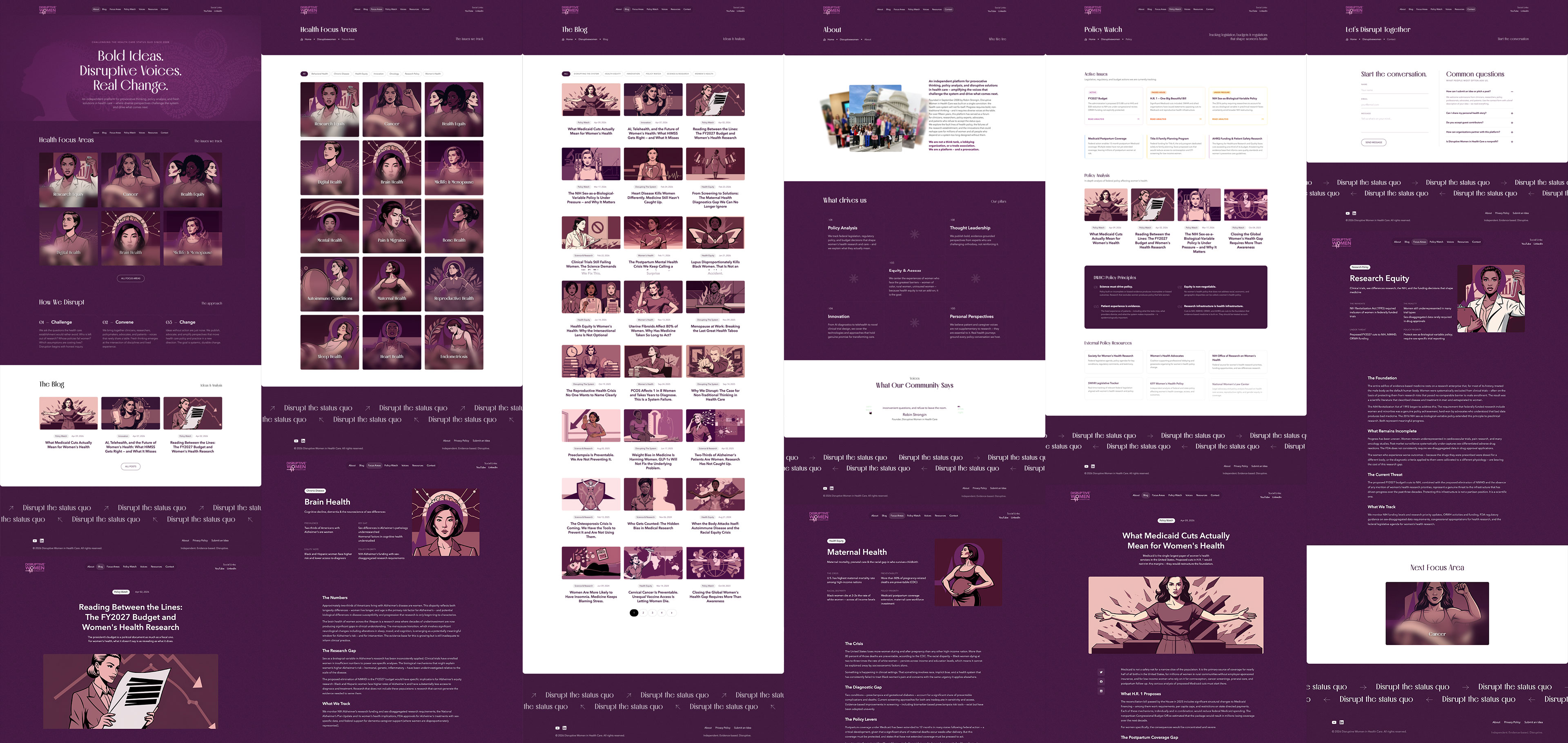
For over fifteen years, this platform has been a provocation. The redesign had one job: look like it means it.
The visual anchor is a custom illustration system built from the ground up — every blog post, every health focus area, its own portrait. Bold linework. Deep plum and mauve. Diverse subjects drawn with graphic novel intensity. Not decoration — identity. The kind that tells you whose platform this is before you read a word.
The rest follows that conviction. Near-black purples hold every surface. Magenta cuts through as accent. A serif display voice for the editorial weight; clean sans for everything that needs to move fast. Even the footer has an opinion. Disrupt the status quo, on a loop — because the message shouldn't have an off switch.
Explore a live copy View full case studyConsistent without being quiet.
Bold enough for the fight.
Credible enough for the policy table.
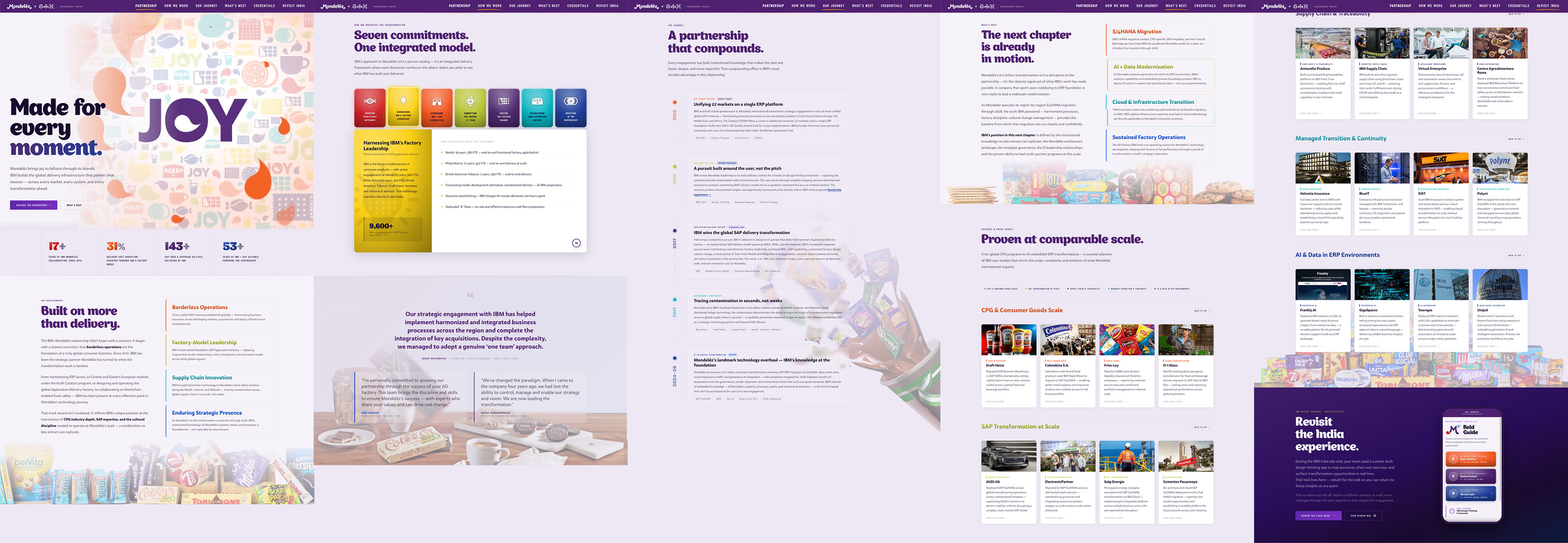
IBM’s multi-year partnership with Mondelēz International spanned branding, design thinking workshops, and global site visits — a relationship that grew more complex with every engagement. The microsite was conceived as a living record of that work — an editorial destination built to be returned to.
Launched after the initial activation and maintained across four years, it gave stakeholders a single place to revisit the partnership’s arc — the thinking behind it, the moments that defined it, and the outcomes it produced. Custom identity, motion, and an information architecture designed for the long arc — built to be returned to over years.
A partnership record built to be revisited — updated year after year as the work grew.
During the 2019 site visit to Mondelēz’s teams in Bangalore, IBM ran live Design Thinking sessions across multiple departments — captured at the time in a printed 23-page workbook. The question that lingered: how do you capture the texture of real conversations, in real time, across three distinct organizational roles?
Years later, I scaled that workbook into a 23-screen field tool, using Claude as a parsing and scaffolding partner. Built around three practitioner personas — each representing a different reality within the organization — the app structures the session into empathy mapping, journey documentation, a four-quadrant opportunity framework, and a shareable summary. Persona-driven flows, dynamic rendering, and an observation grid designed to be used on your feet — the workshop made portable, retroactively.
Design thinking as a live instrument — built for the field, used in it.
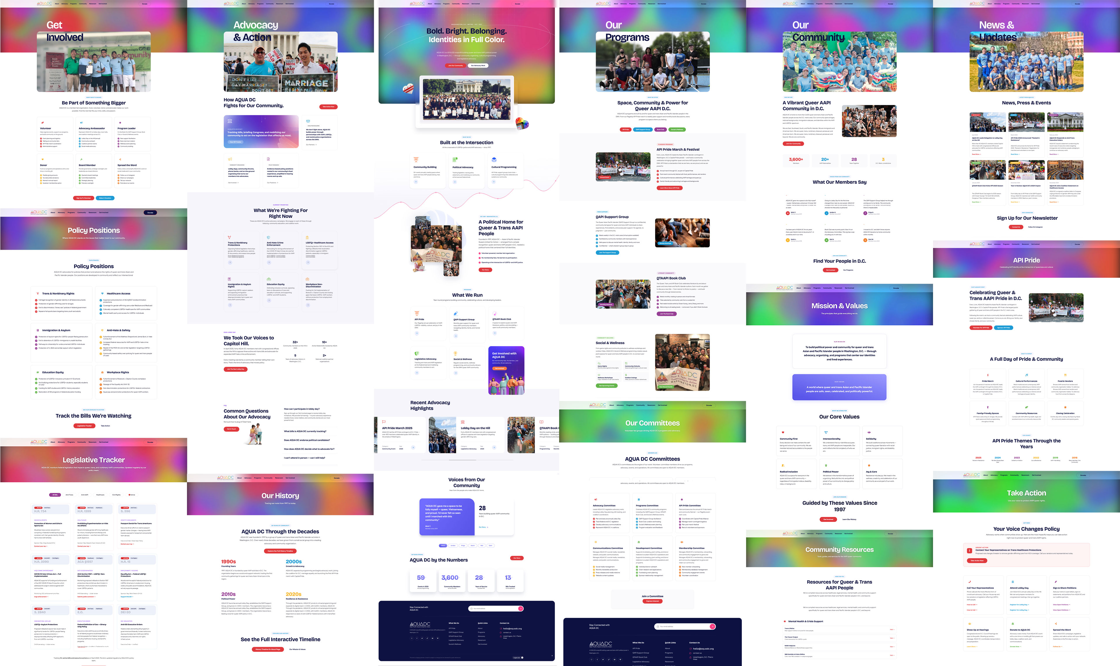
A complete ground-up rebuild of AQUADC.org — a full-stack front-end build designed to match the scale and ambition of the organization's work. The architecture maps directly to how AQUADC actually operates: advocacy, programs, community resources, and a living history going all the way back to 1997.
The site spans 20+ unique pages built mobile-first, with an interactive history timeline navigable by decade, a live legislative tracker monitoring federal anti-LGBTQ+ bills, program pages for API Pride and the QAPI Support Group, a testimonials carousel, and a community stats dashboard. The brand's coral, teal, navy, lavender, and gold palette became a full visual language — each section carrying its own color signature while remaining cohesive across the whole.
Built to serve a community — and earn its belonging.
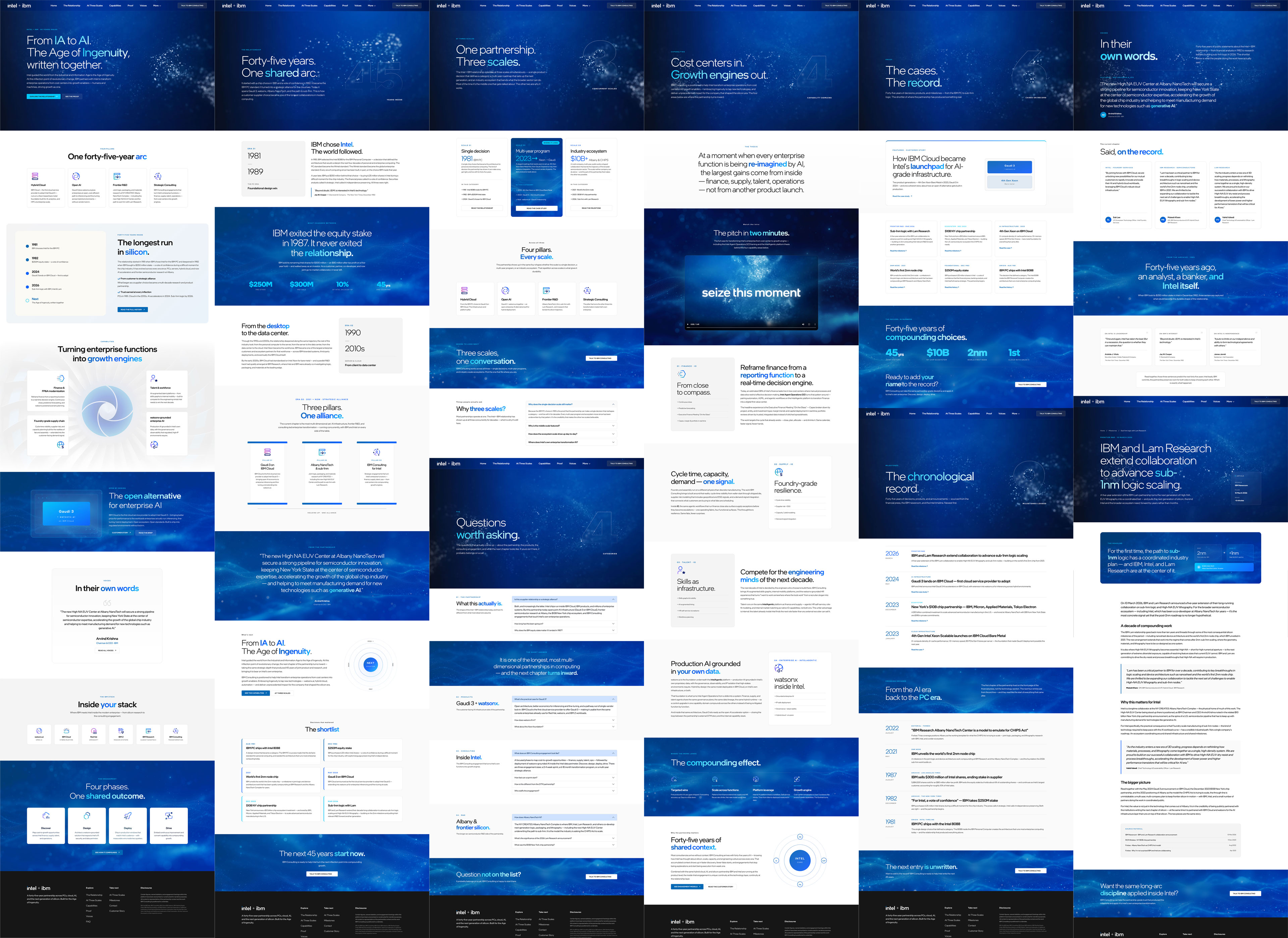
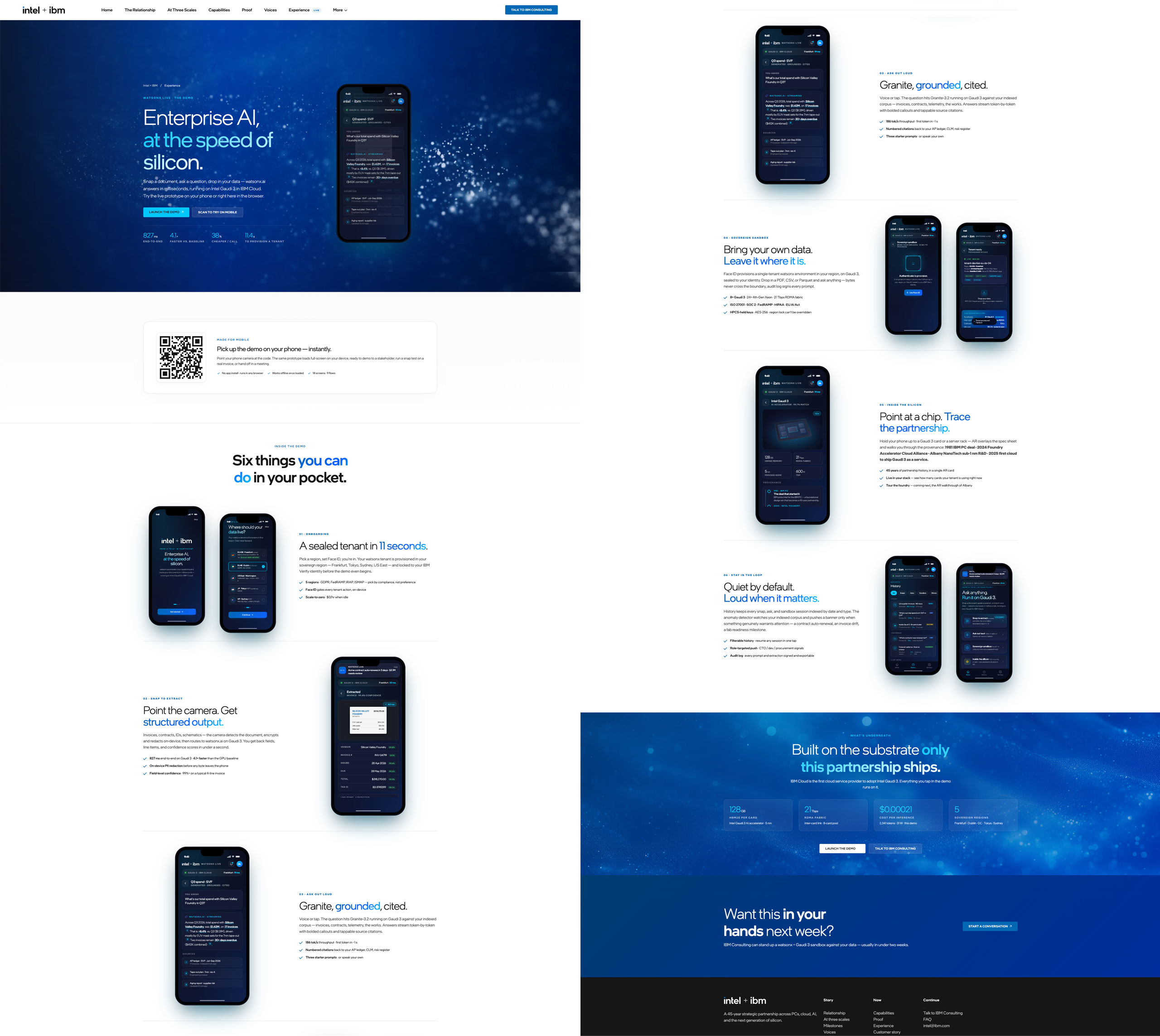
Forty-five years of IBM and Intel — across PCs, cloud, AI, and the next generation of silicon. The microsite extends a 2024 partnership engagement into a permanent digital destination: a place where the IA-to-AI thesis, the iO operating model, and the four capability domains can keep being argued, shared, and pressure-tested long after the room emptied out.
Twelve pages of editorial built around a custom brand system layered over IntelOne Display — hero video loops sourced from the studio shoot, the opening film embedded inside the capabilities page, IBM duotone iconography throughout, and a hand-built engine pinwheel that rotates idly and snaps on card hover. Designed to read as a living argument that holds up past the meeting.
What lived in the room found a permanent place to keep being argued from.
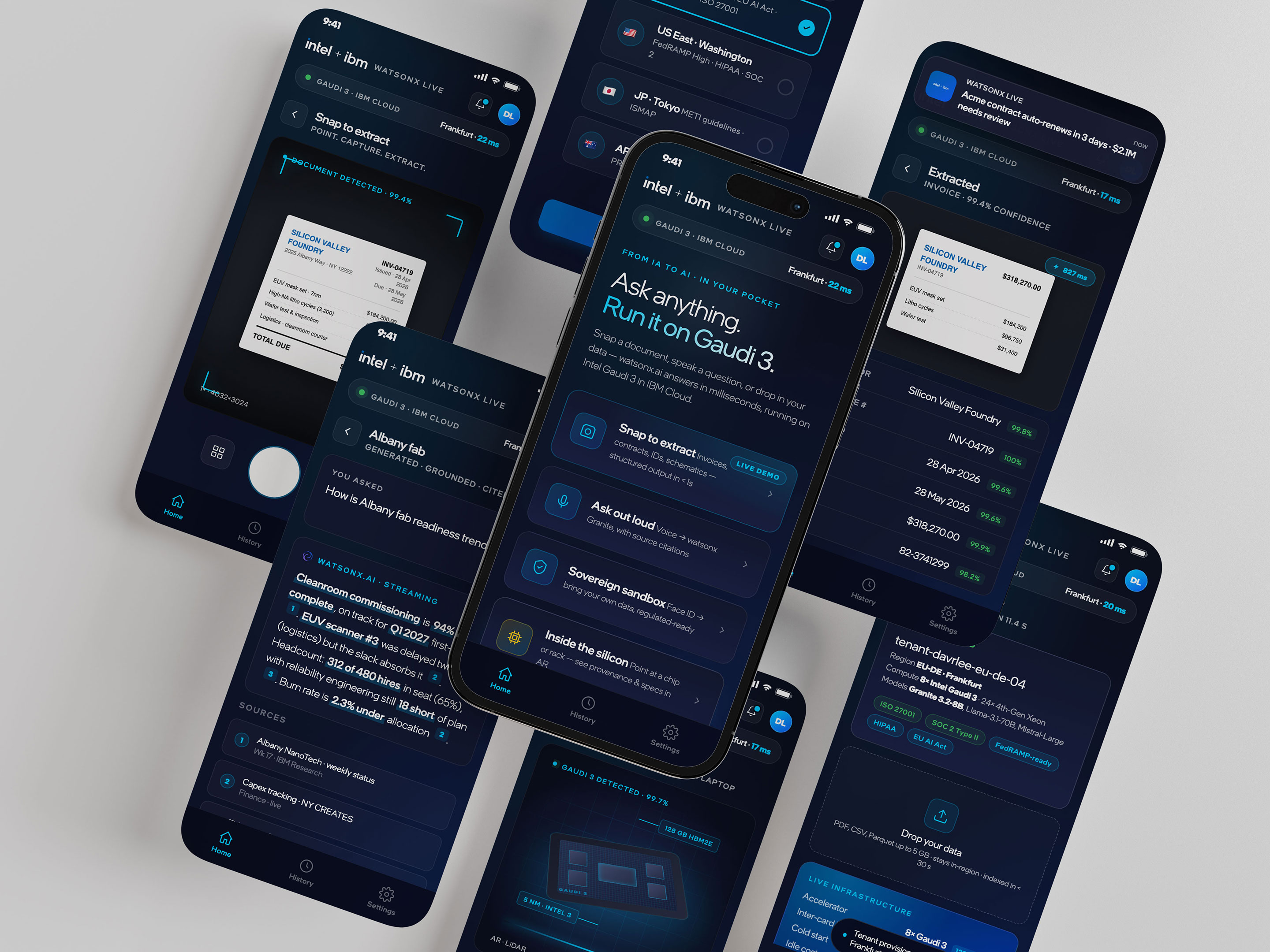
If the microsite kept the argument alive after the room, the mobile prototype gives the partnership somewhere to live next: in someone’s hand, in a meeting, on the floor of a data center. watsonx Live extends the IA-to-AI thesis into a clickable iOS experience — built so a stakeholder can hold the argument in their hand.
Eighteen screens across nine flows. Snap an invoice and watsonx.ai — running on Intel Gaudi 3 in IBM Cloud — returns structured fields in 827 ms. Ask Granite a question with grounded, cited sources. Point the camera at a chip and trace forty-five years of partnership history in AR. Provision a sovereign sandbox in eleven seconds and bring your own data.
The argument, in pocket form.
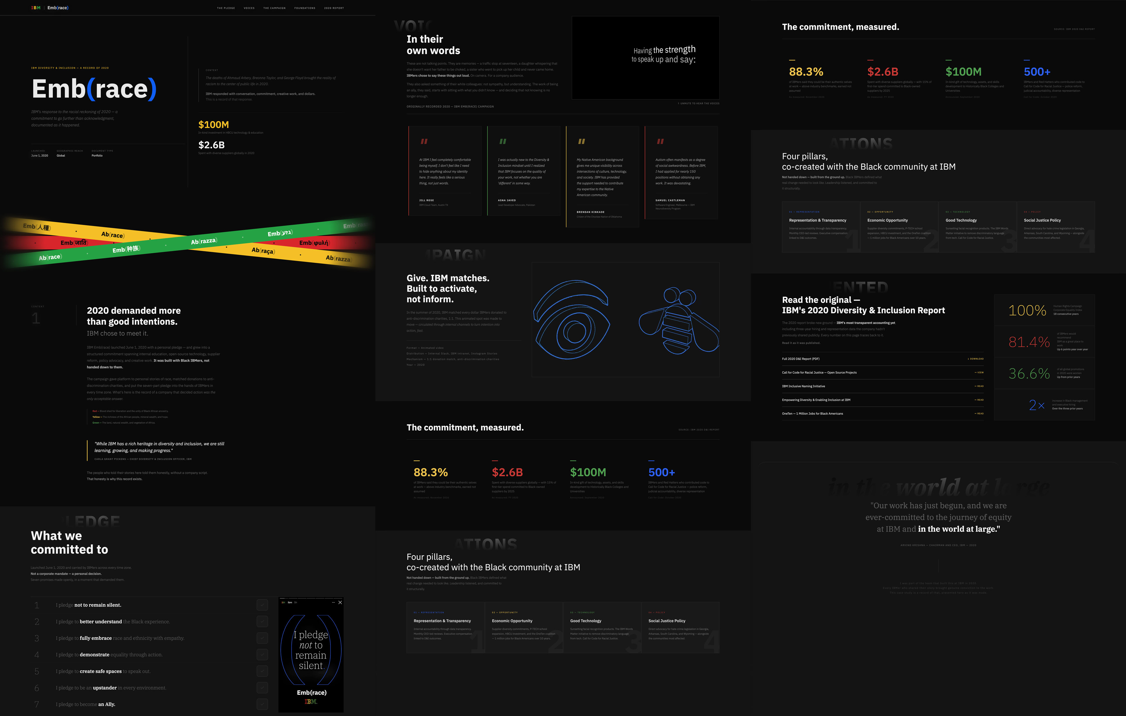
June 2020. IBM’s response to the deaths of Ahmaud Arbery, Breonna Taylor, and George Floyd wasn’t a statement — it was a commitment. A seven-part personal pledge carried by IBMers in every time zone. A 1:1 donation match for anti-discrimination charities. $100M in technology and support to HBCUs. A four-pillar framework for structural change, co-created from inside the Black community at IBM.
The microsite was built to hold all of it honestly. At its center: Black IBMers who chose to speak on record, without a script, about what it actually felt like. The campaign, the numbers, the voices, the 2020 D&I Report. A record of a company that answered the moment.
View full case studyAction over acknowledgment, as it unfolded.
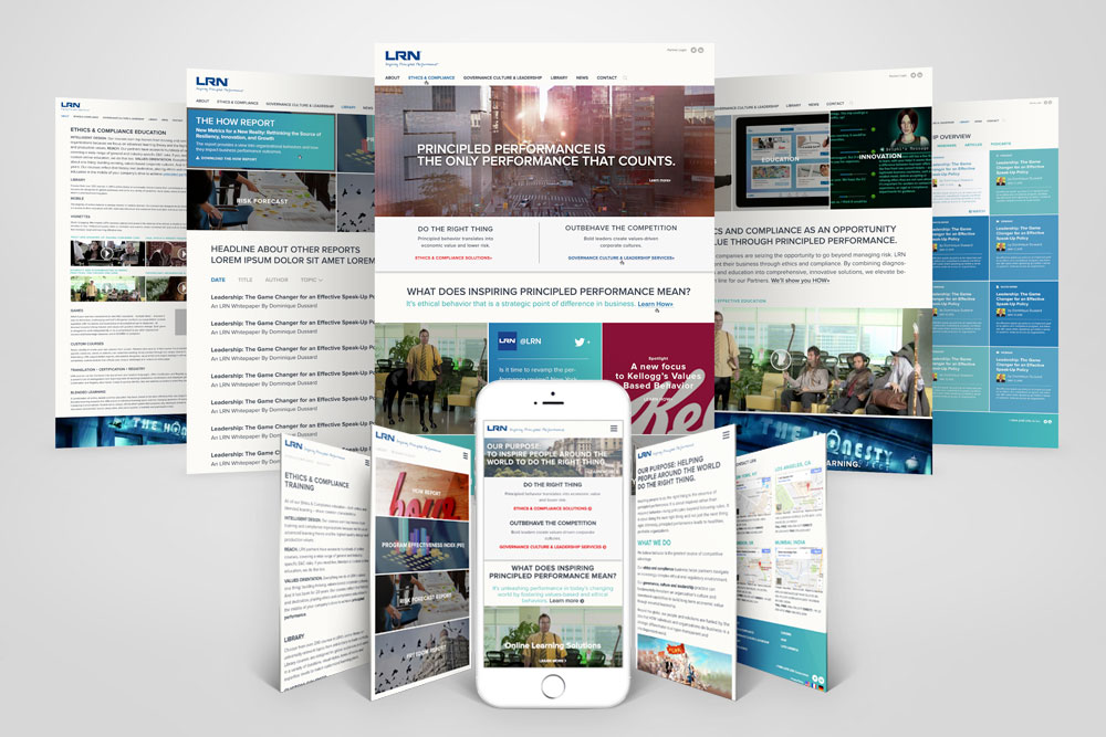
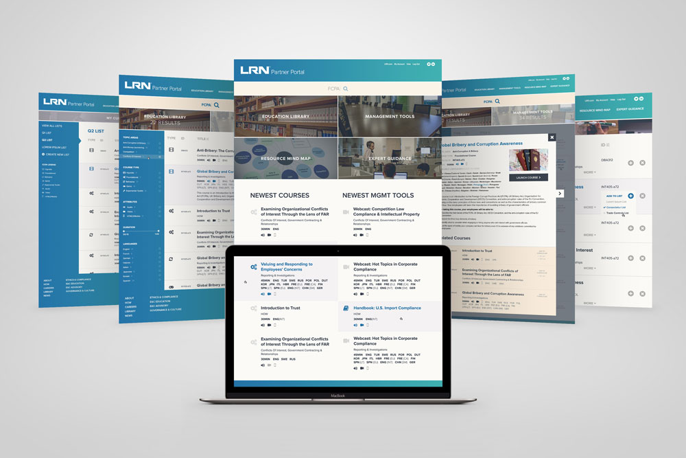
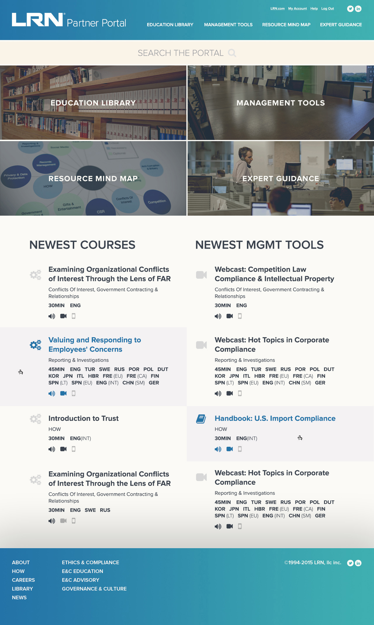
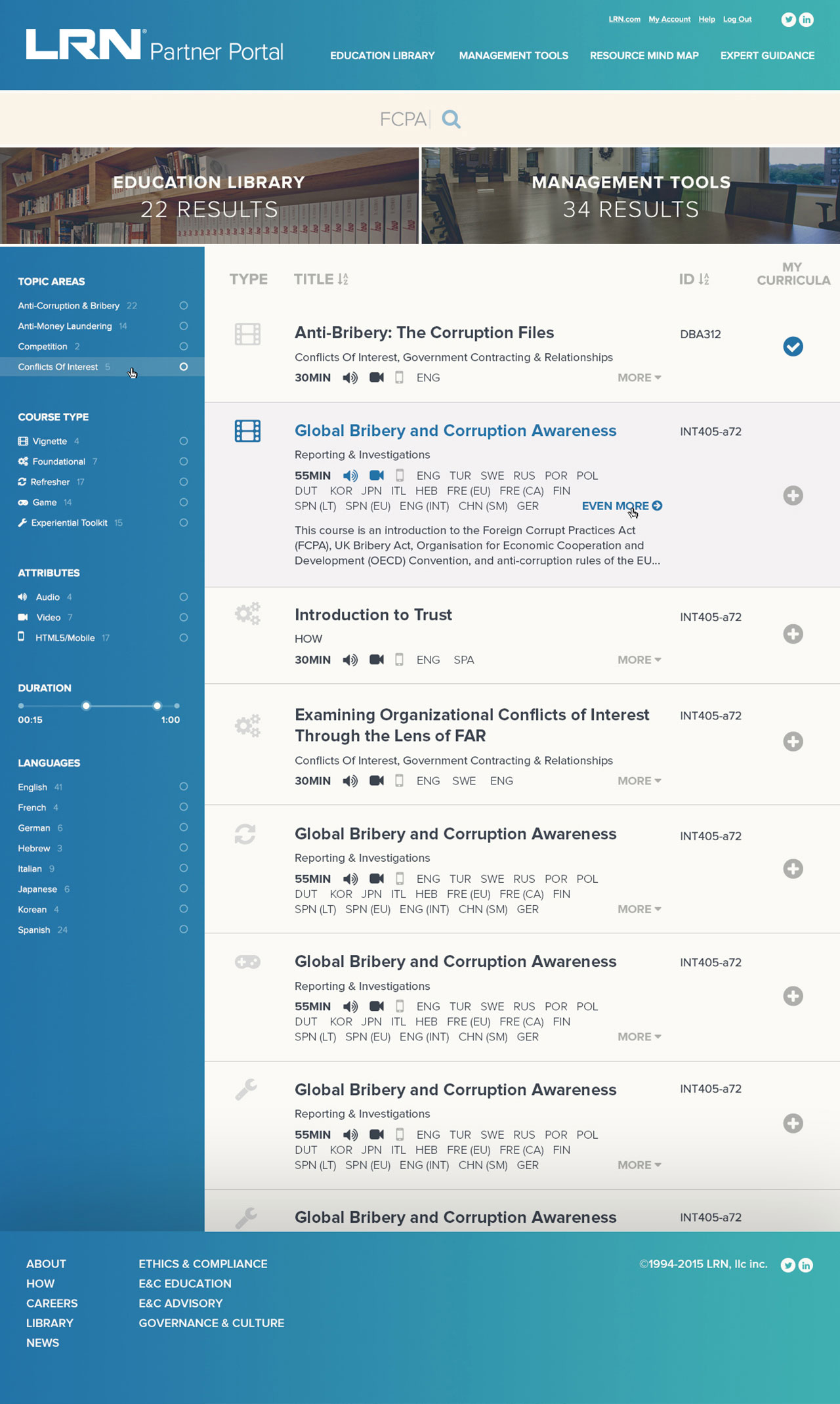
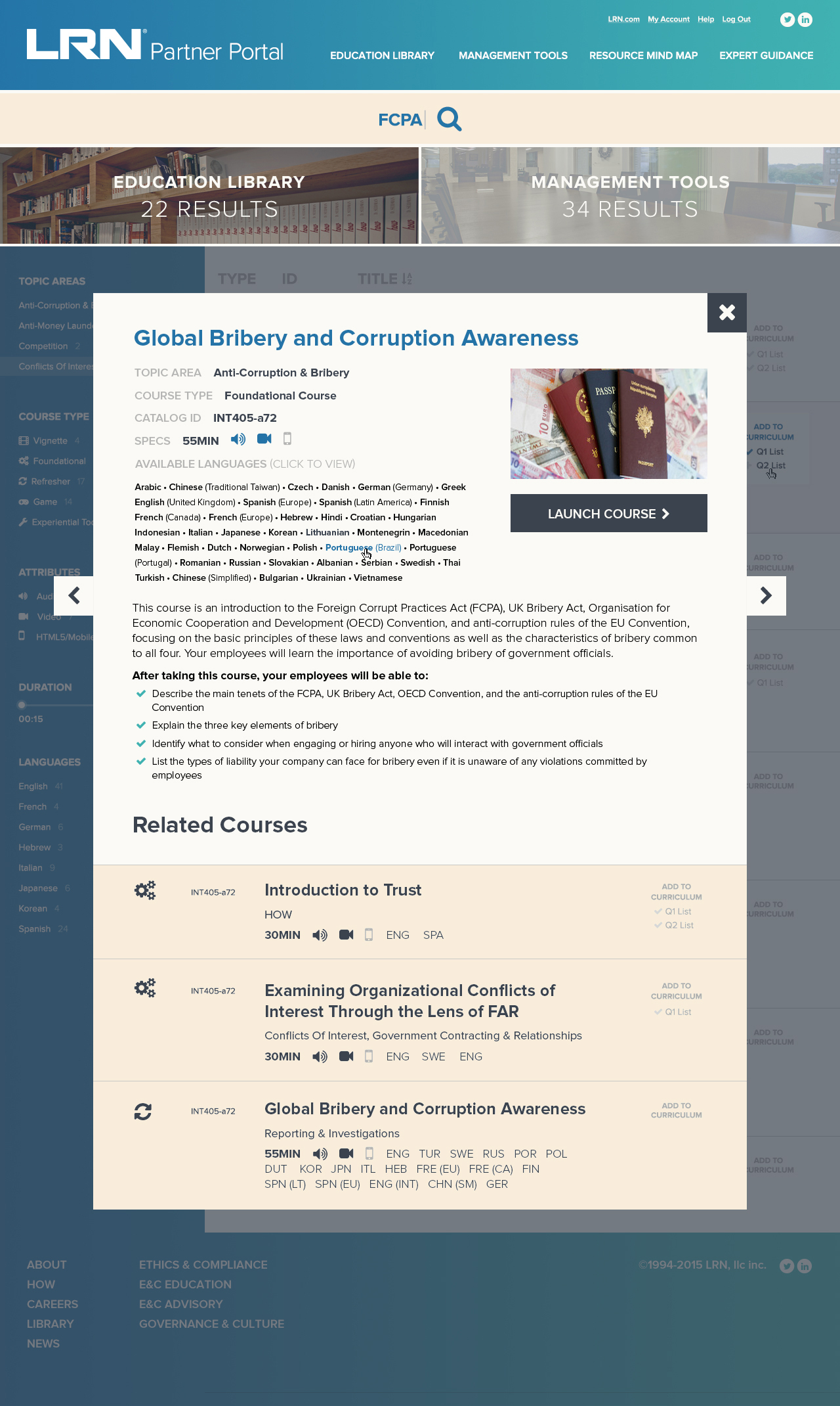
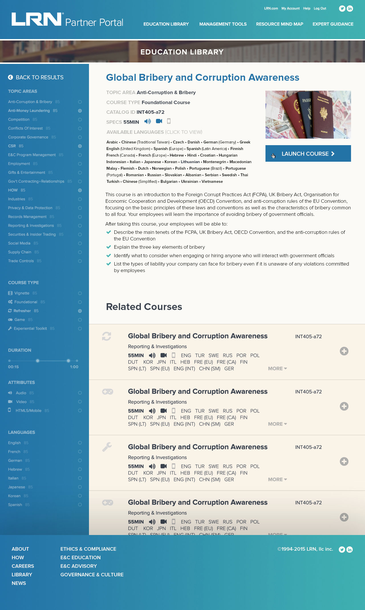
LRN.com and editorial platform work — information-dense environments that needed visual hierarchy above all else. Typography as wayfinding, color as category, white space as relief.
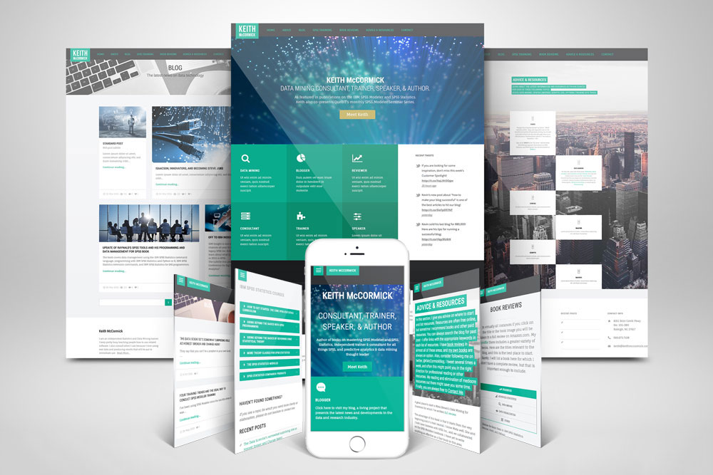
Keith McCormick and brand-led web experiences — sites that had to represent institutions while still feeling human. The work of making something look effortless.
JetBlue in-app GUI and mobile UX work — designing for the thumb, building for the moment of use. Every tap state considered, every error state anticipated.