


The object becomes the interface.
Inside a Louis Vuitton boutique, the sales associate is the Maison. The bag is the artifact. Anything between them — a tablet, a screen, an app — risks breaking the spell of service. The challenge: design a tool the associate actually wants to hold, one that elevates the encounter at every turn. Every interaction had to feel like service, gesture by gesture. Every transition had to read as one continuous gesture.
The work landed on two surfaces — a scrollable microsite that frames the design language, and Maison, a 16-screen mobile interaction system that walks one sales associate through one client’s day, from morning sign-in to a piece returning for resale a decade later. Same motion grammar across both surfaces; same sense that the technology is in the room only as long as it serves.
I led the work end to end — interaction model, motion choreography, visual language, and editorial voice across both surfaces. Every transition was tuned by feel, written in a stack a real product team could pick up and ship.
Opener film for the engagement — cut on shared history, present partnership, and what comes next, paced to energize at the level of feeling.
Direction · Edit · Sound — DRL
A document opens once. An environment stays open. The Louis Vuitton work became a scrollable microsite — a place to read, move through, and return to. Six subjects sit on the page like a sheet of postage stamps, each in its own color. Choose one and the others quiet down; the page settles into that single subject and holds there, one screen at a time — so a dense brief reads at the pace of attention, not all at once.
The grid is the menu.
The pin is the meal.
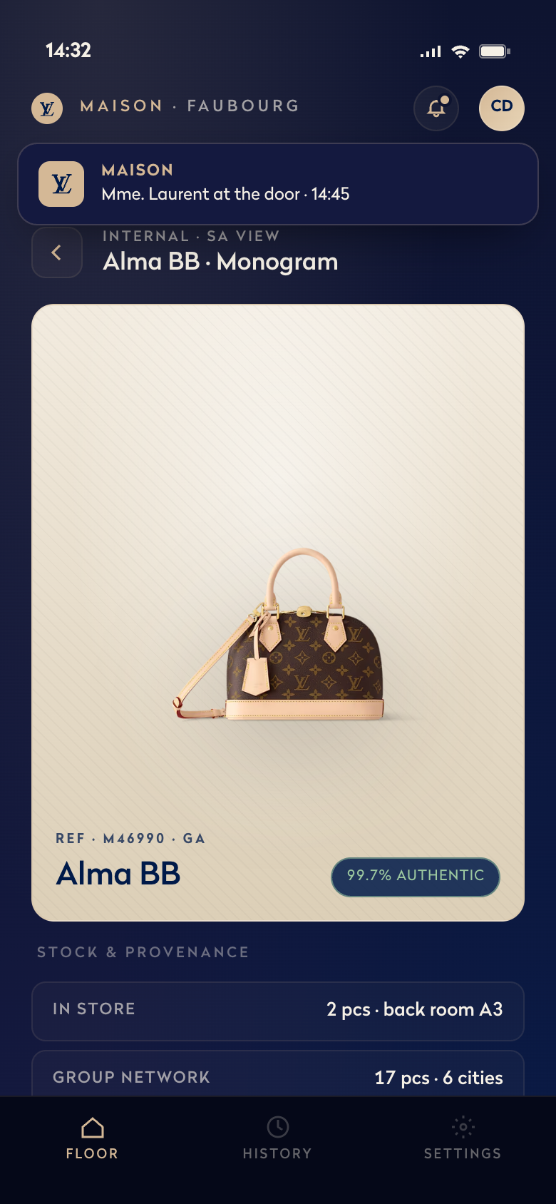
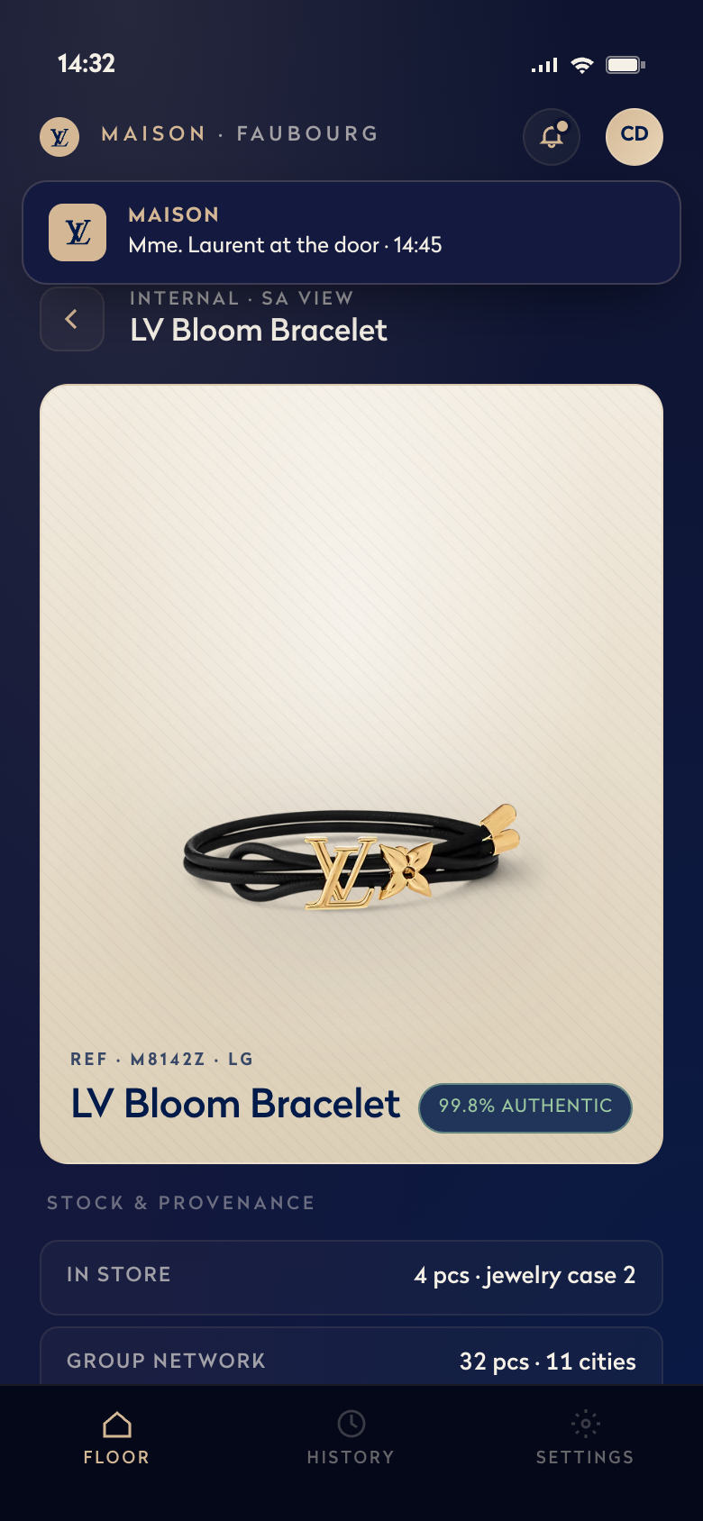
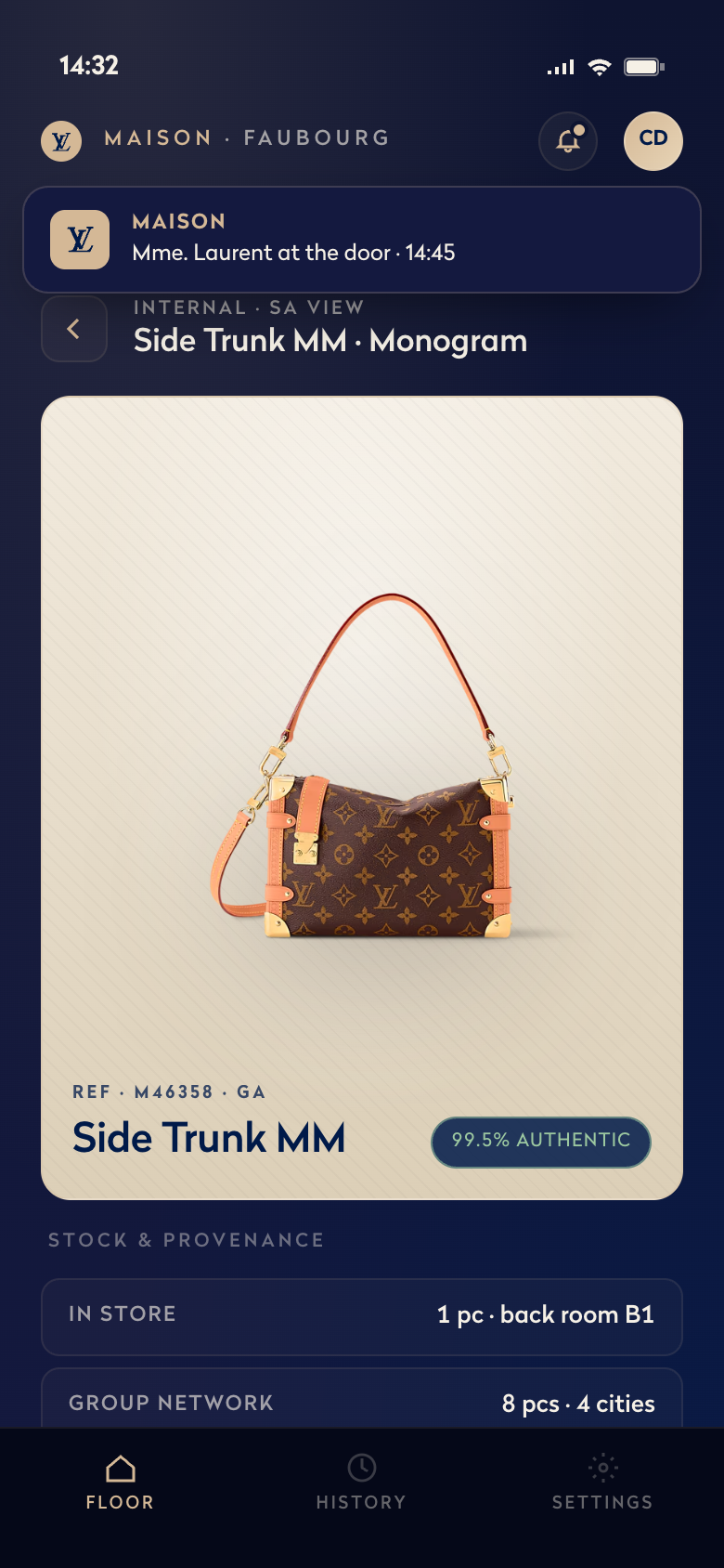
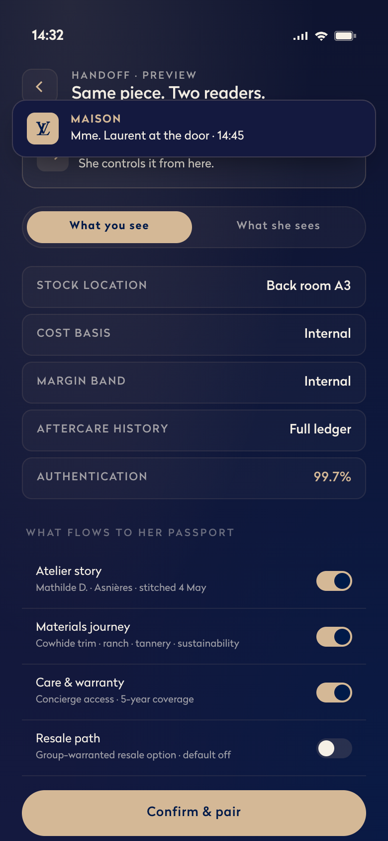
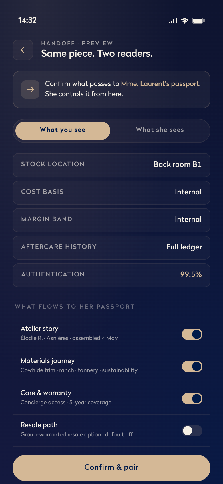
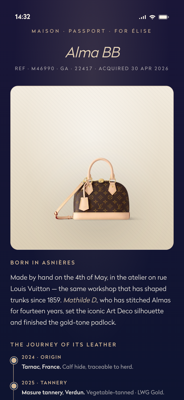
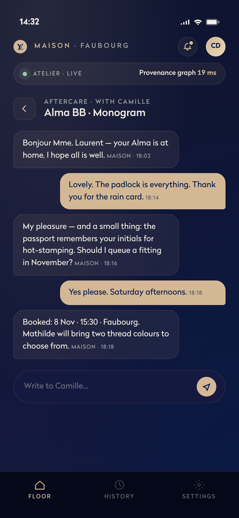
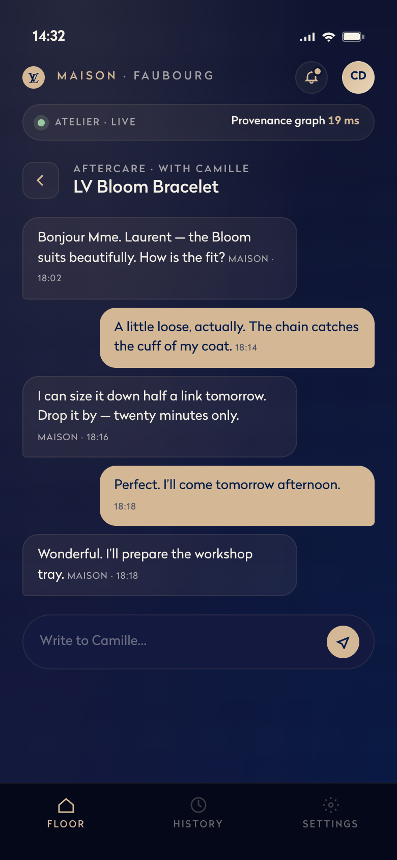
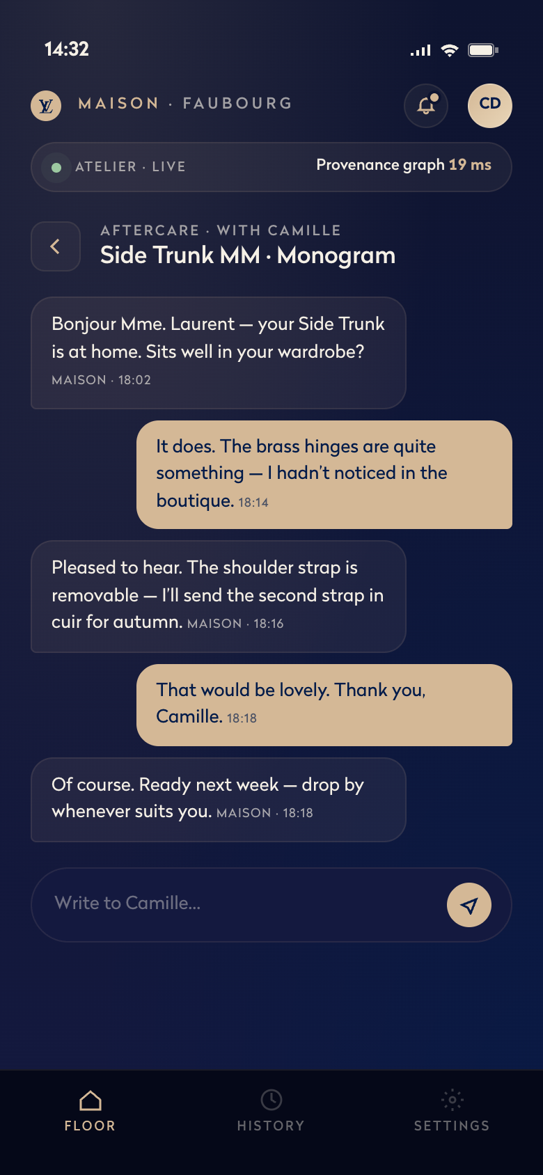
Each ritual is motion to a narrative effect — a story beat, not a screen state. Maison is a 16-screen mobile interaction system that turns the moments software usually interrupts — sign-in, recommendation, handover, authentication, aftercare — into ceremonies the associate can hold in one hand.
Sign-in opens with the brand mark blooming into place — a moment of recognition. But authentication is the ritual that matters most: a viewfinder opens, a cream beam eases across the bag, and the wait that would usually be a spinner hides inside the choreography — perceived latency, dissolved into ceremony. Then the bag answers. A warm light grades across the leather, and the verdict lands on the object, not the screen — the object becomes the interface, and the device gets out of the way.
On the editorial microsite, the same brand-mark morph loops inside a halfway-cropped phone, framed in the page like a still from a film just paused. The device extends past the section’s bottom edge and fades — a quiet signal that there’s more inside without forcing the click.
Every interruption, a ceremony.
One easing curve, applied across every surface. Every transition tuned to feel fluid, natural, inevitable. The brand-mark morph between diamond and flower is paced like a held breath: slow approach, quick transition, soft landing. The curve underneath is sine-in-out — the simplest physical model of breathing. The same rhythm threads through everything — the page loads on it, the tiles catch on it, the scan fades and clears on it.
Tap any moment to feel the curve. The page-load loader, the authentication scan, the capability tile — same easing across all three.
A cream scanline crosses the bag while a four-step provenance check runs underneath. The wait — usually a spinner — is hidden inside the choreography itself; the bag visibly registers the warm light passing across.
Open the auth screenThe wordmark fills bottom-up as the page loads behind it — same easing as the diamond ⇆ flower morph above. One mark, ticked frame by frame against the percent counter.
Reload the prototypeCapability tiles arrive as the section locks in — a slow approach, a soft overshoot, a settled landing. Same rhythm as everything else, applied to a different beat in the page's life.
View on the micrositeThe prototype is the spec. The whole system is plain HTML, CSS, and JavaScript — no framework, no build step. Every motion choice lives in code a product engineer can read, fork, and extend on day one; nothing is locked behind a Lottie or a designer’s machine. The brand mark lives once as a reusable component, referenced from the page-load loader and three places inside the prototype — the kind of small design-system move the larger work is built on.
Each of the 16 screens has a design brief committed alongside it in the repository, with intent, screen states, and motion timing named the way an engineer needs them — see for example the authenticate brief, which spells the four-step pipeline at 140–480ms per check. The handoff is the repo; the spec and the running prototype are the same artifact. A small live readout at the top of every screen pulses with the system’s real response time — so the prototype reads as a running system, not a mockup.
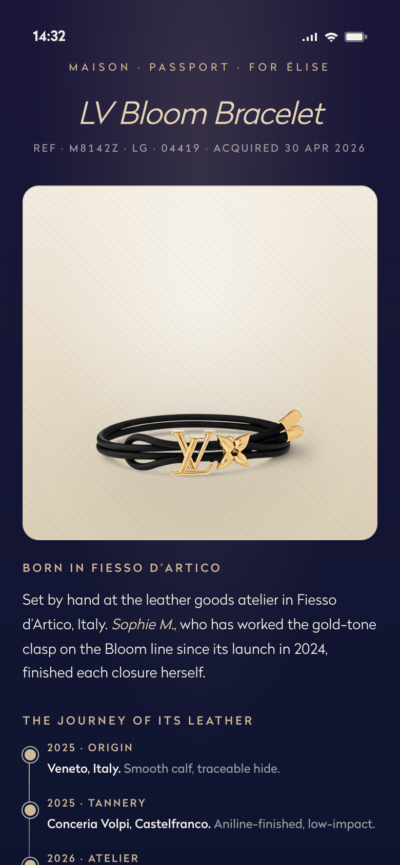
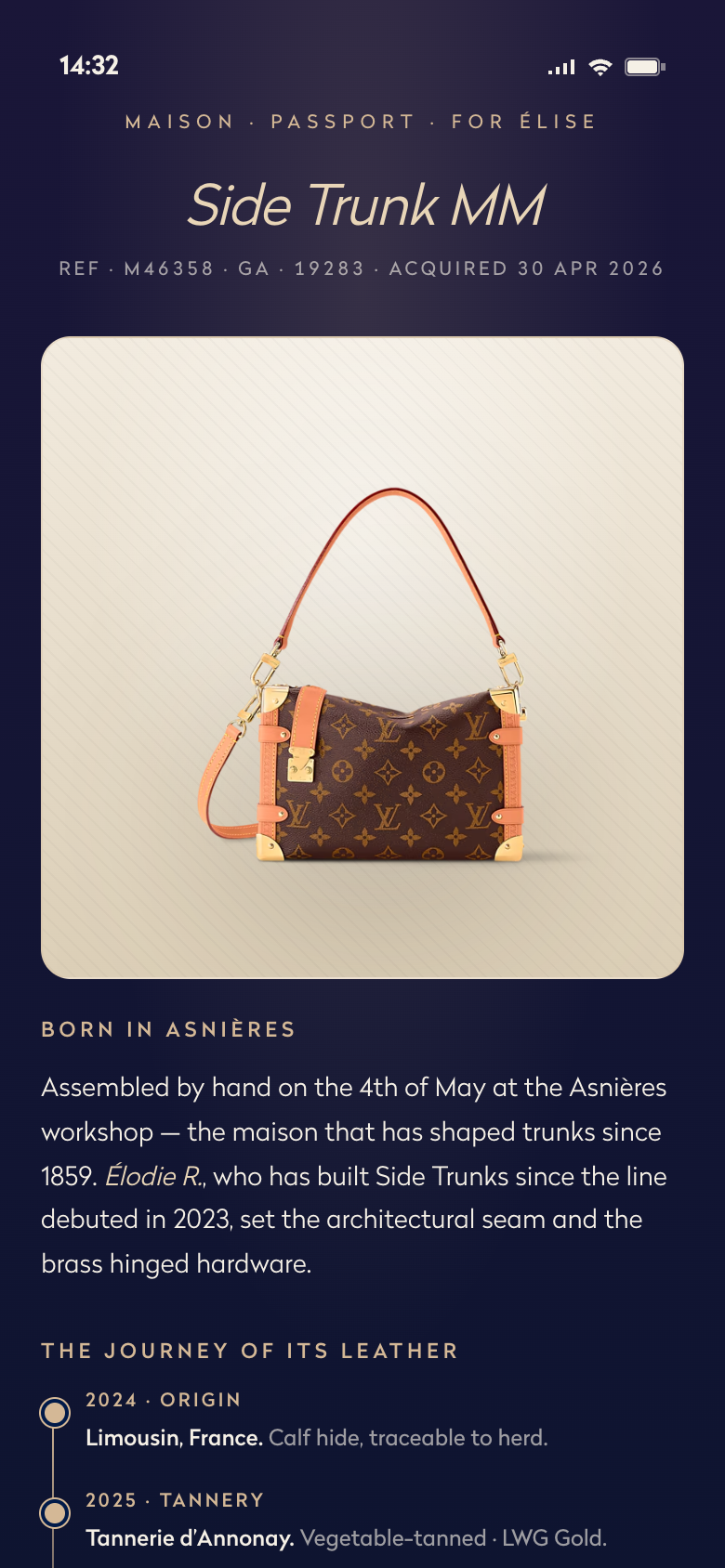
From morning sign-in to a resale a decade later — every screen captured. Each tile opens the rendered screen.
The medium is the service.Every choreography is a small promise about how the brand behaves.
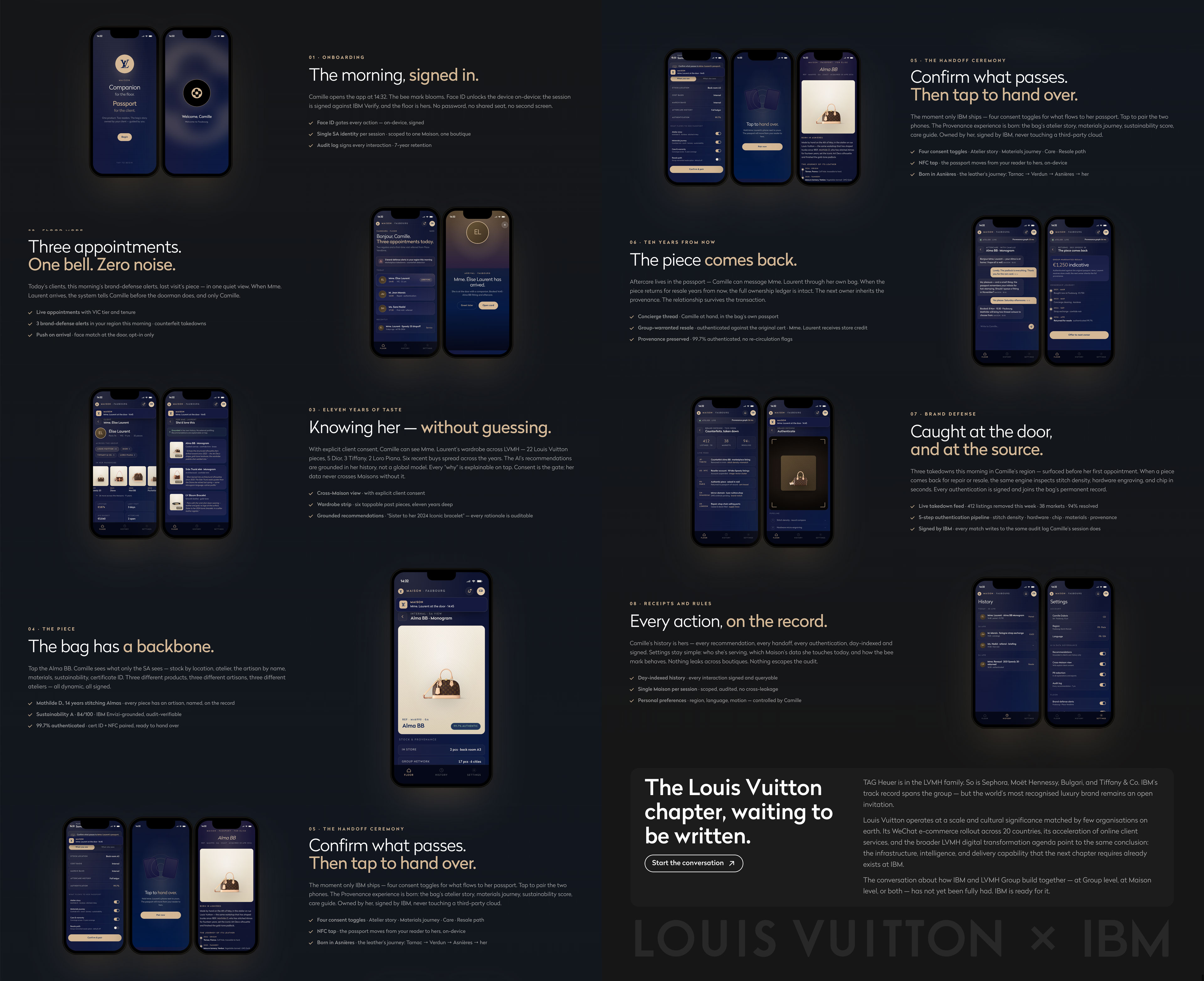
Four screens, three product types each — handbag, jewelry, trunk.
The architecture flexes before motion is layered on.

I made every choice; AI sharpened many of them. Before any motion was drawn, I assembled a corpus — LVMH’s 2020 annual report, the 2006 LVMH × IBM Information Server engagement, the 2018 IBM × Tommy Hilfiger AI-design pilot, LVMH’s current Omnichannel & Data org — and briefed Claude on it. The corpus shaped what “ritual” meant for an LV associate, what IBM × LVMH precedent the page could honestly claim, and what tone the editorial voice could carry. The same partnership ran in the dev loop: brief, critique, decide — often five or six iterations to a beat before the motion read as a decision, chosen and paced on purpose. AI as the design partner you brief on intent and review for craft — accelerant, not author.
Six passes to one beat.