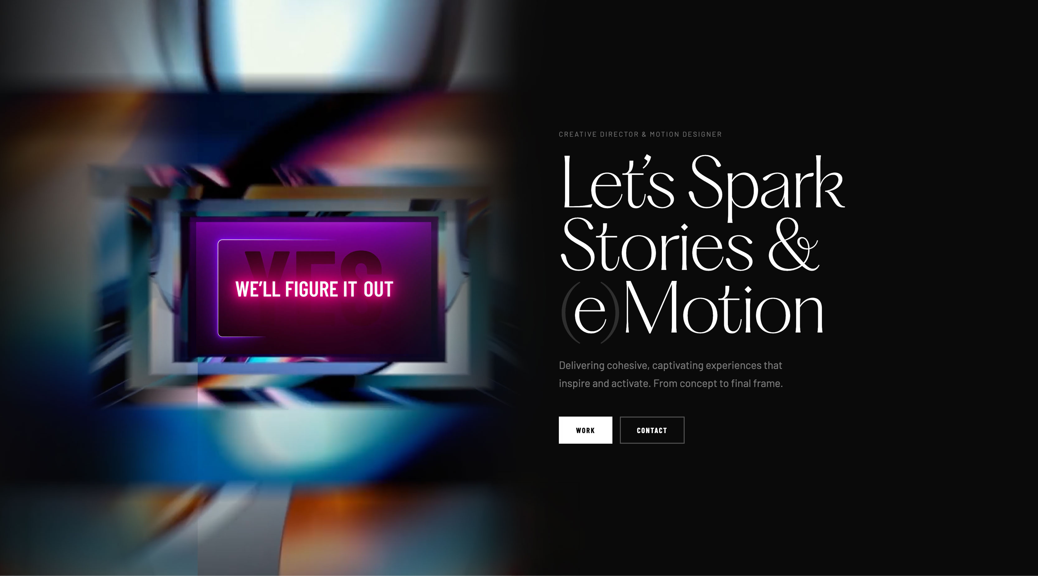


Every touchpoint, regrounded on the circle.
JetBlue at twenty was still the disruptor it had launched as — the low-fare carrier that taught American aviation what hospitality at altitude could feel like. But the visual system around it hadn’t aged at the same rate as the brand promise. The 20th anniversary was the moment to mature without losing the spark.
I led the refreshment proposal — grounding every element on the circle, JetBlue’s foundational brand shape. From subway takeovers to aircraft livery, from a redesigned booking flow to a quieter, more human social feed, every touchpoint reconsidered. The brief: act its age without forgetting why it started.
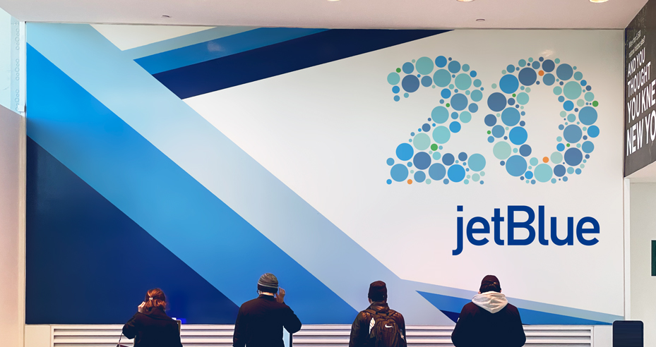
JetBlue is New York’s airline, but the brand had stopped acting like it. An MTA partnership brought the carrier back into the city it calls home — a logo sting and station takeover that turned a subway commute into a brand encounter. The circle motif mapped cleanly onto the MTA’s own visual language: two New York institutions speaking the same shape.
Two New York institutions, one shape.
The circle did the talking.

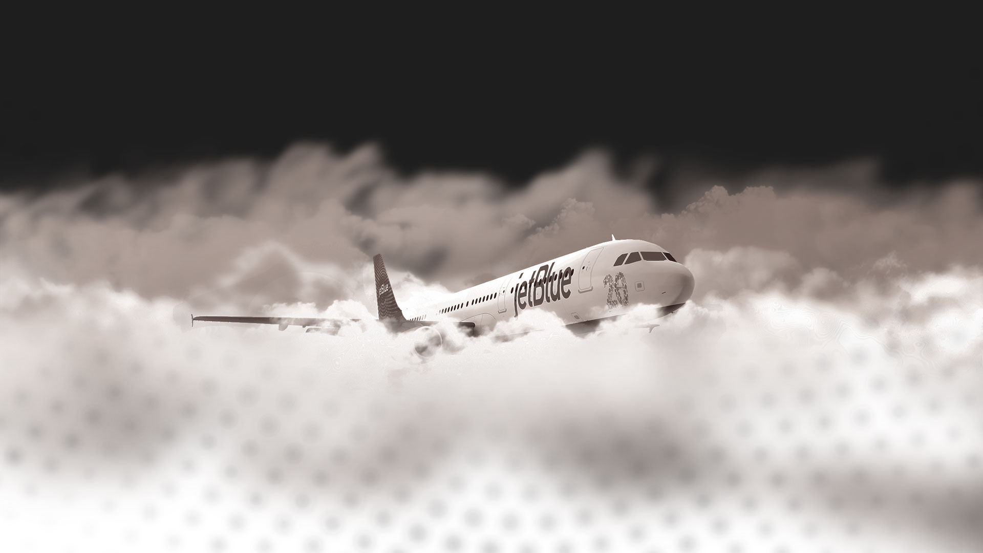
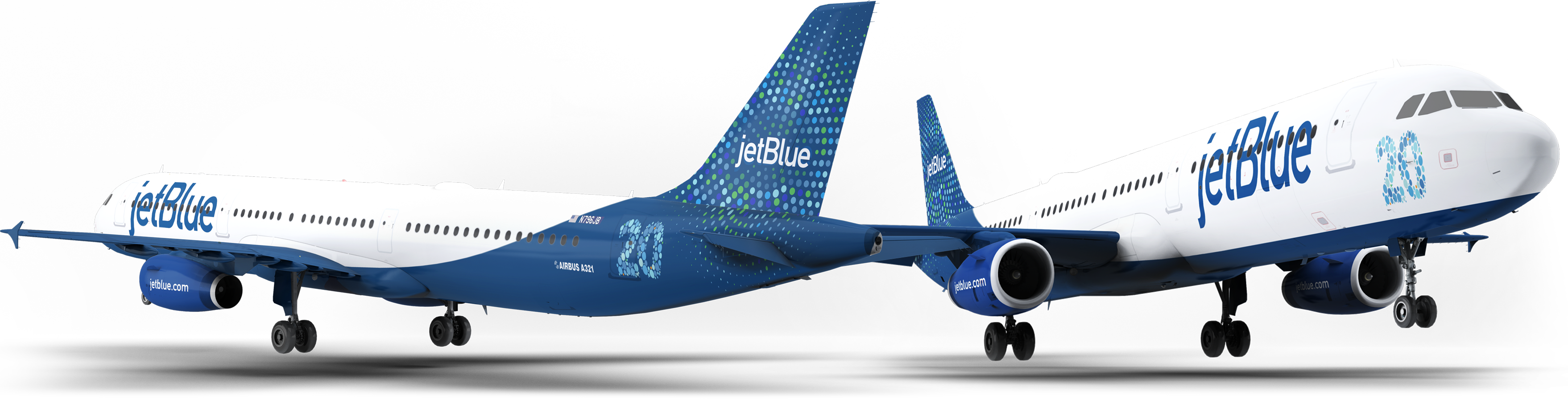
A commemorative ‘20’ design for the Airbus A321neo body — restrained, legible, and unmistakable. The livery treated the plane as a canvas without losing the discipline of aeronautical design: an anniversary mark you can read from the jetway, then forget by the time you reach your seat. The quiet confidence of a brand that no longer needs to introduce itself.
An anniversary mark you can read from the jetway.
The rest of the plane just flies.
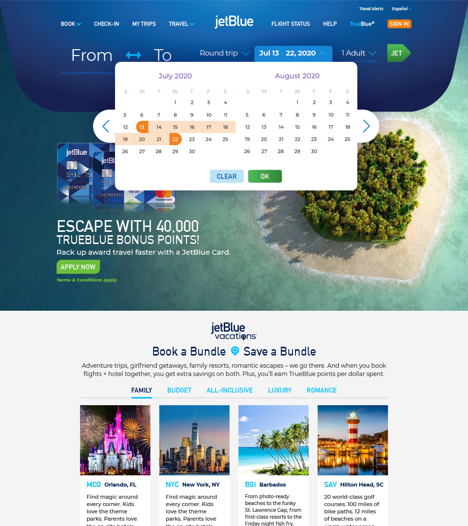
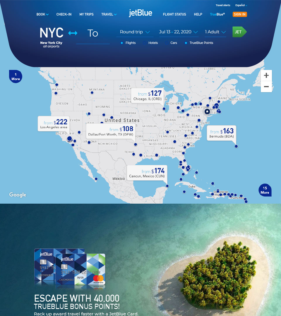
The homepage had drifted into a feature graveyard — every internal stakeholder’s priority surfaced equally, none of them well. The redesign reset the hierarchy around what actually converts: a streamlined web carousel, a single clear path from arrival to fare, and breathing room around every booking moment. The homepage earned its place in the funnel again.
A homepage that knows what it’s for.
One clear path to fare.
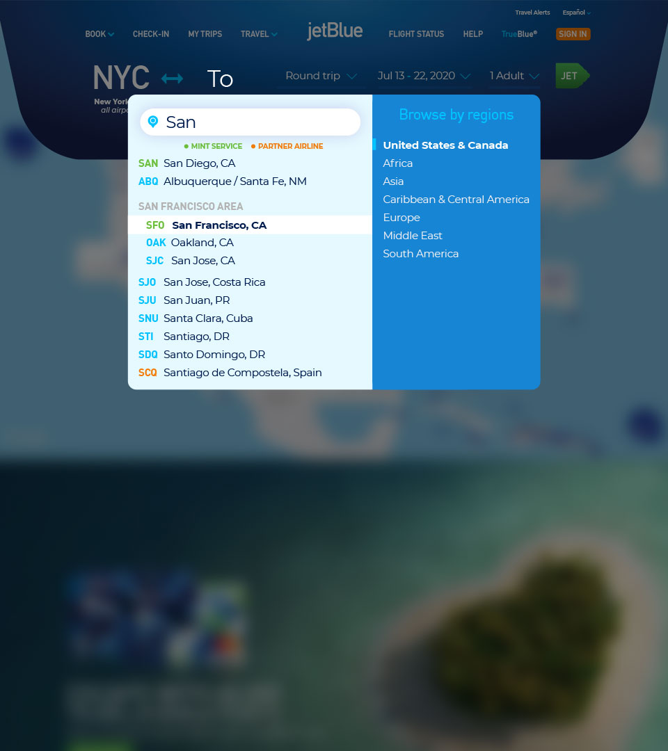
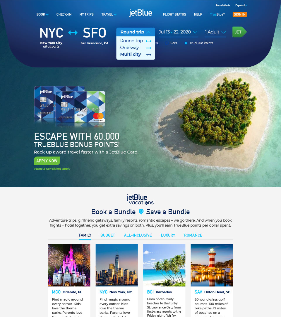
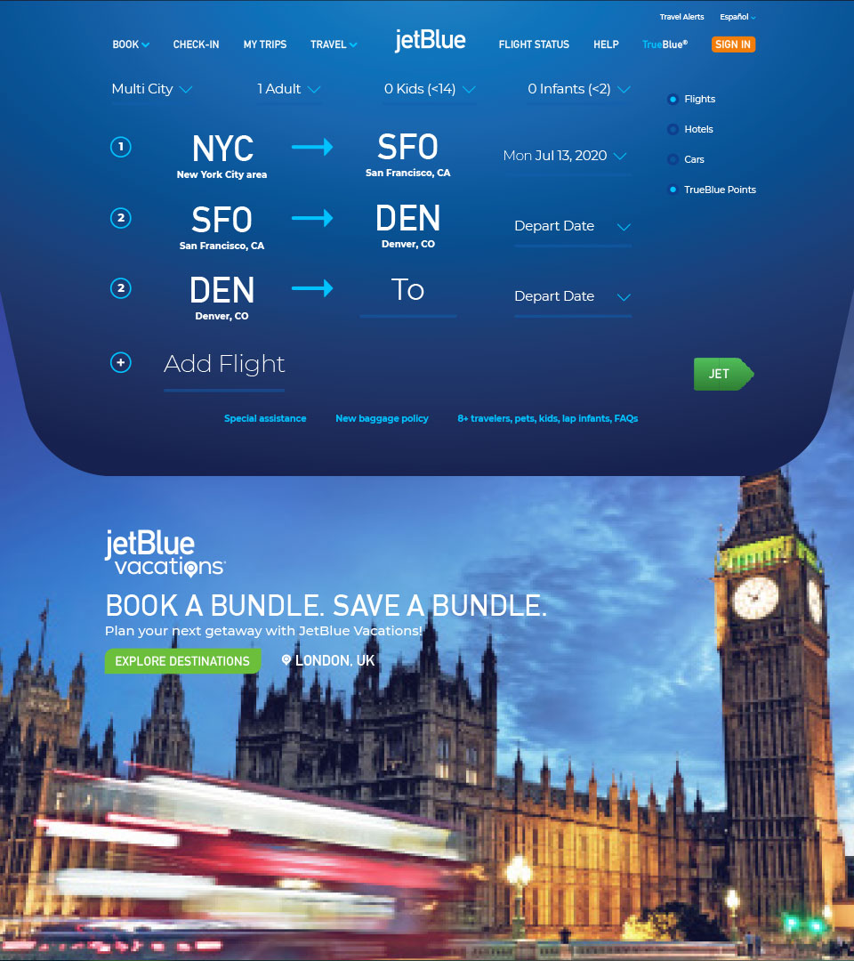
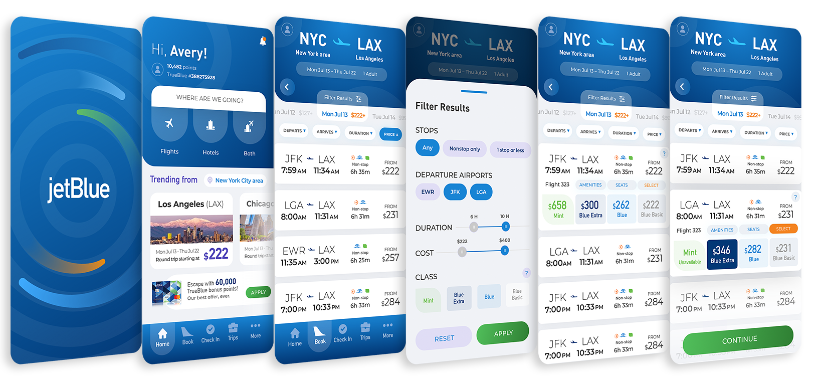
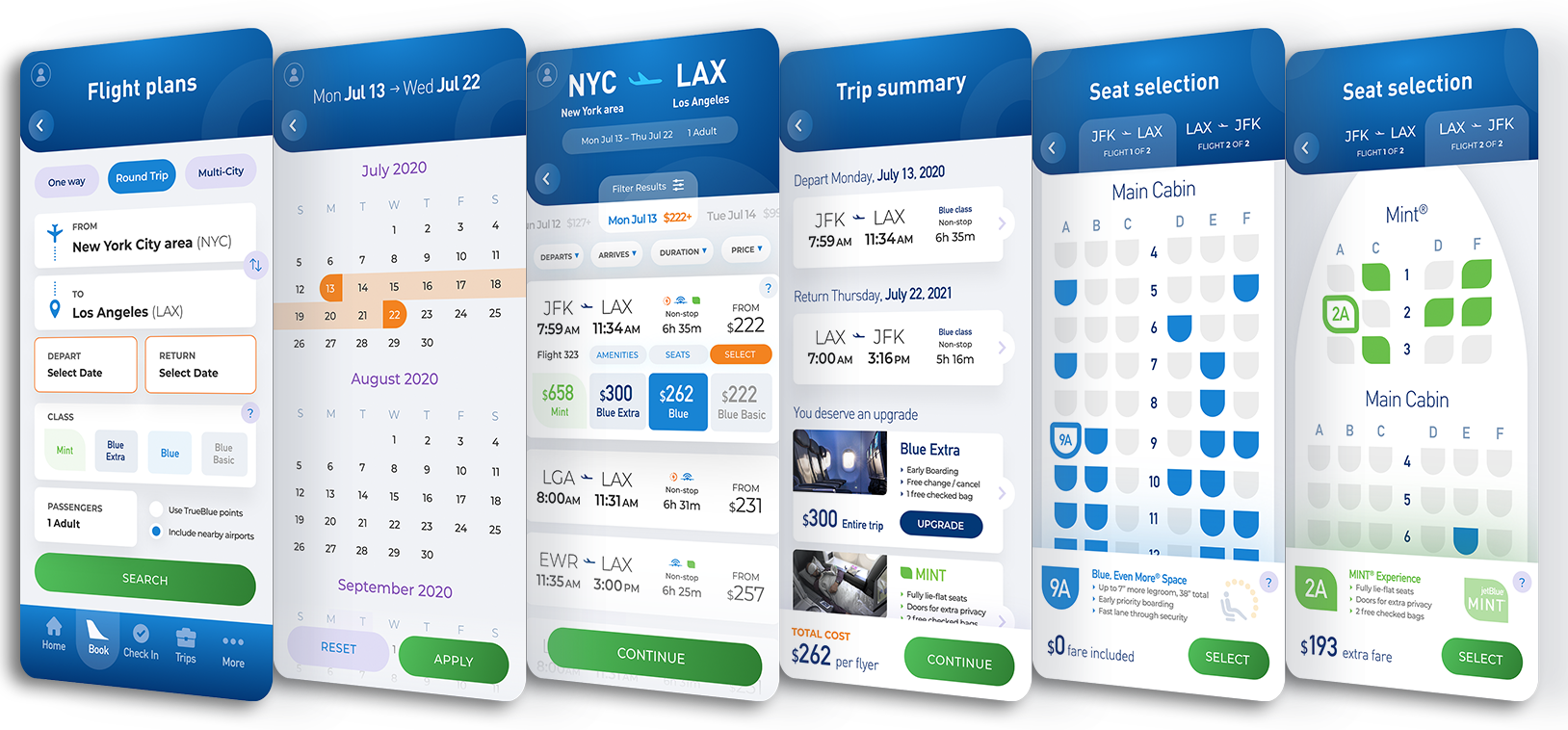
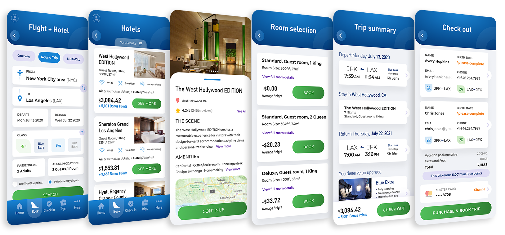
In-app browsing got a new GUI calibrated to how travelers actually scan a phone — sparse, generous, fast. The booking flow took on a color-coded grammar of its own: orange for active fields, green for advancing. A functional process became an intuitive one — the system telling you where you are and where you’re going without asking you to think about it.
Orange means you’re here.
Green means you’re moving.
The interface does the rest.
JetBlue’s Instagram had been a stream of corporate beats. The system reframed it around the people who actually fly the airline — crewmember quotes, destination photography, lived moments from the seat. The grid stopped sounding like a press release and started sounding like a passenger.
A grid that stopped reading like a press release.