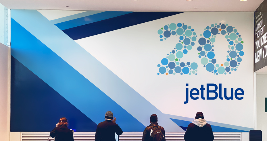

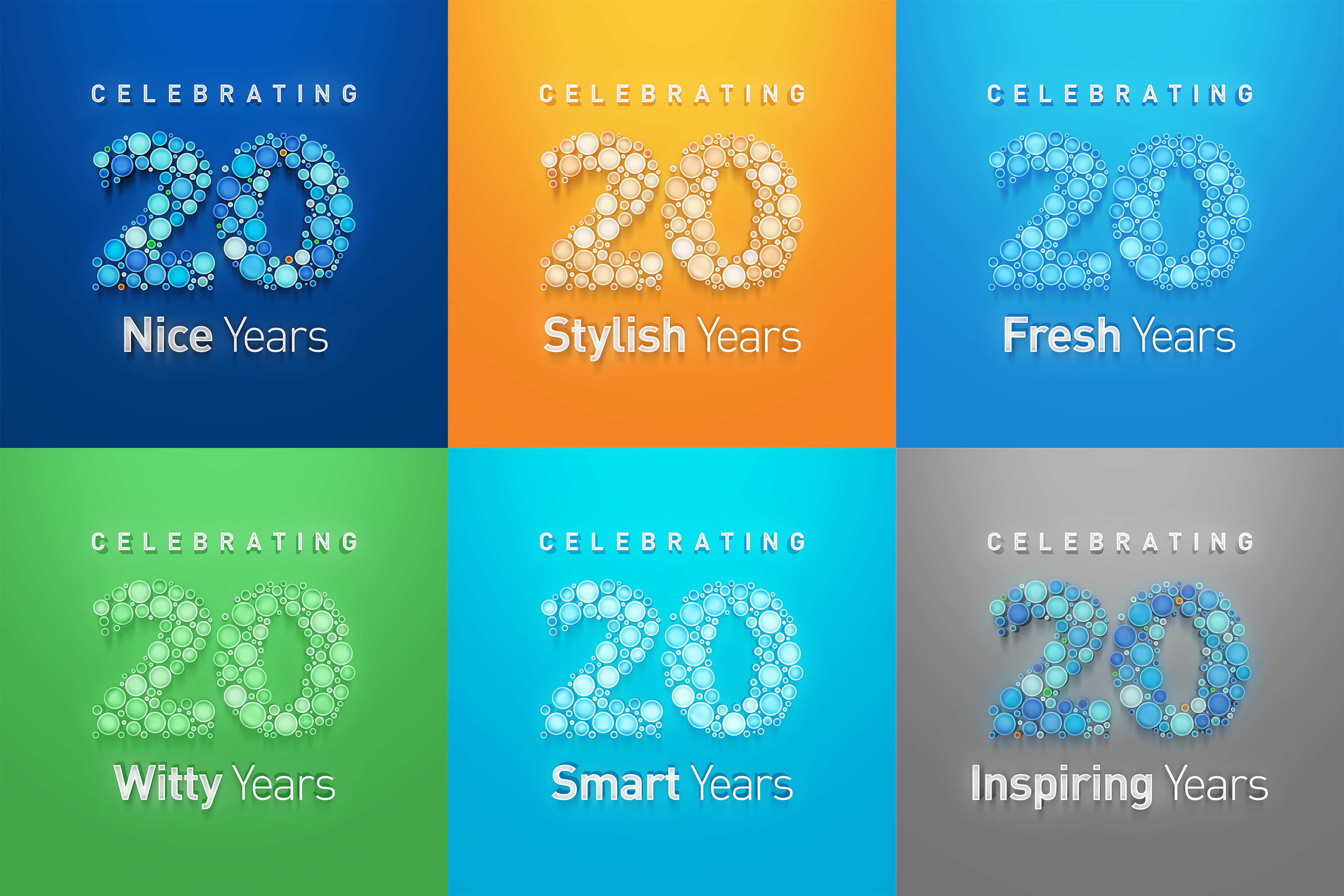
Sparking moments to pause in transit through JFK airport
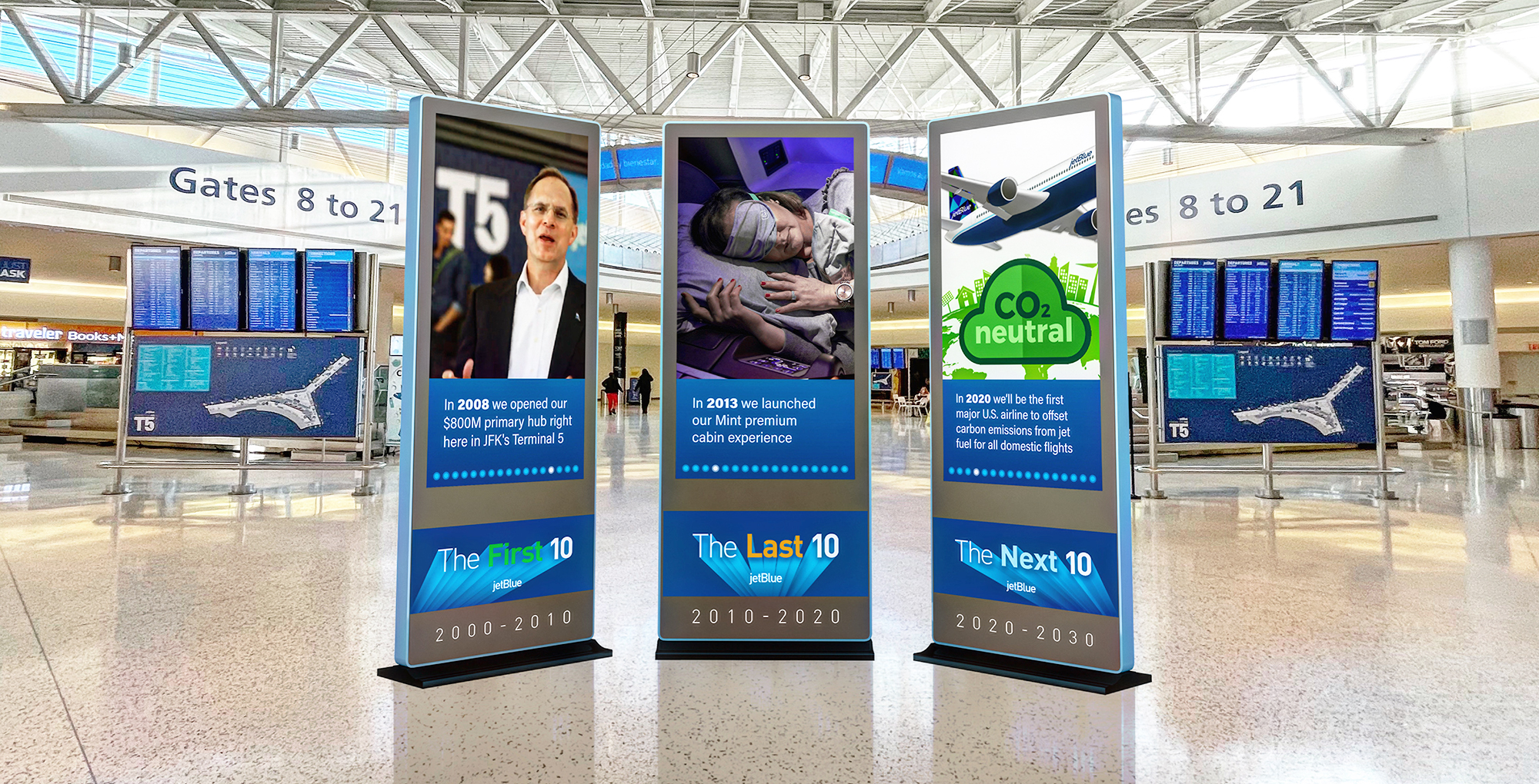
JetBlue's home base lives in JFK's Terminal 5, where activation kiosks give transiting passengers an overview of the company's heritage in three distinct stages:
2000-2010 The First 10: How we started.
2010-2020 The Last 10: How we've been.
2020-2030 The Next 10: Where we'll go.
While 'The First 10' provided highlights of how JetBlue lay a foundation of growth, 'The Last 10' illustrated the ramp-up of achievments that bring the airline to its present day status. 'The Next 10' represents an inflection point for the company, showcasing leading innovations that reinforce the organizational mission to Inspire Humanity.


Taking New York's Hometown Airline on the subway
Sharing the circle in common with New York MTA's subway lines, a logo sting was created to advertise JetBlue's trademark as New York's Hometown Airline and partnership with Empire State Development.


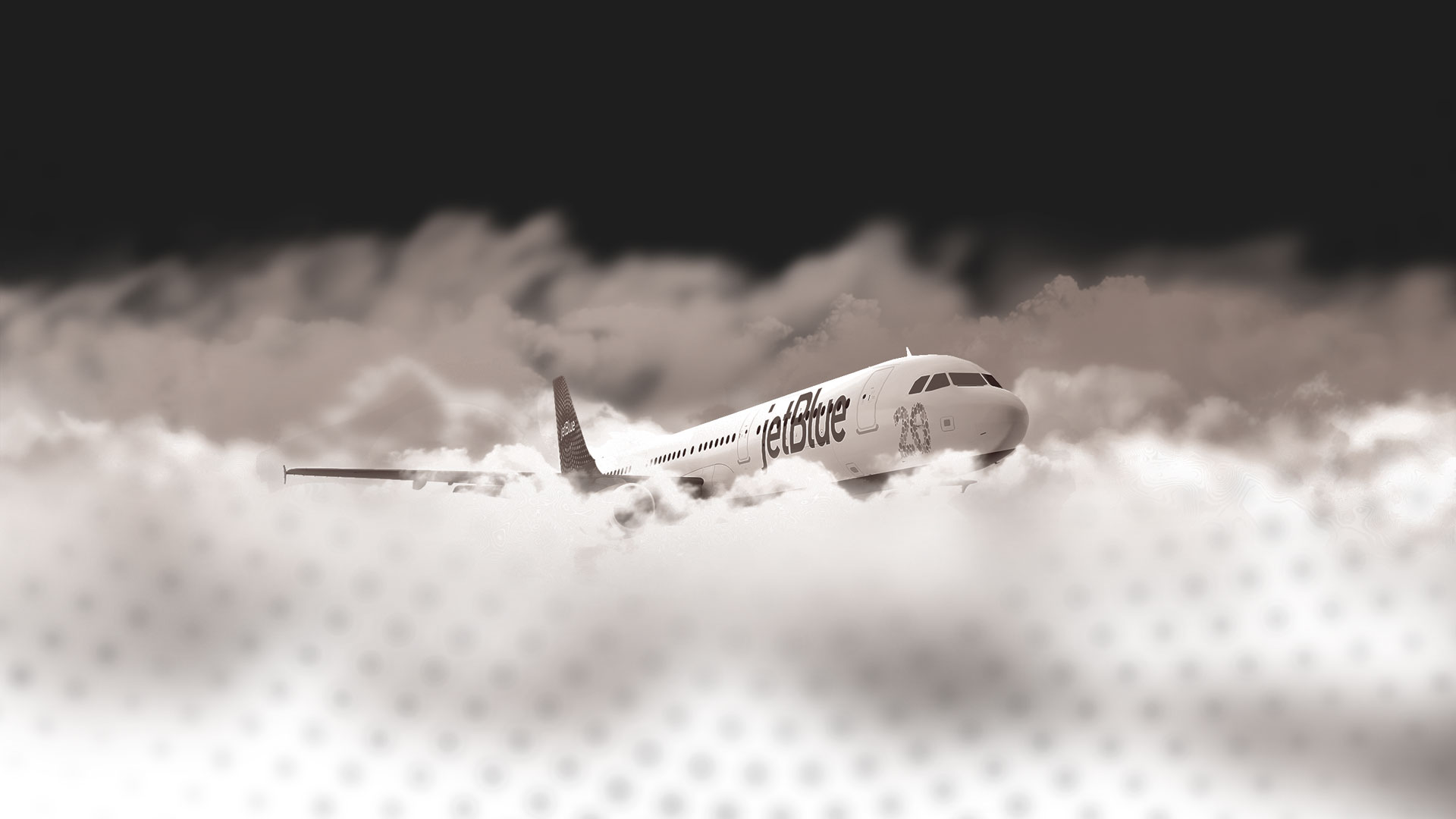
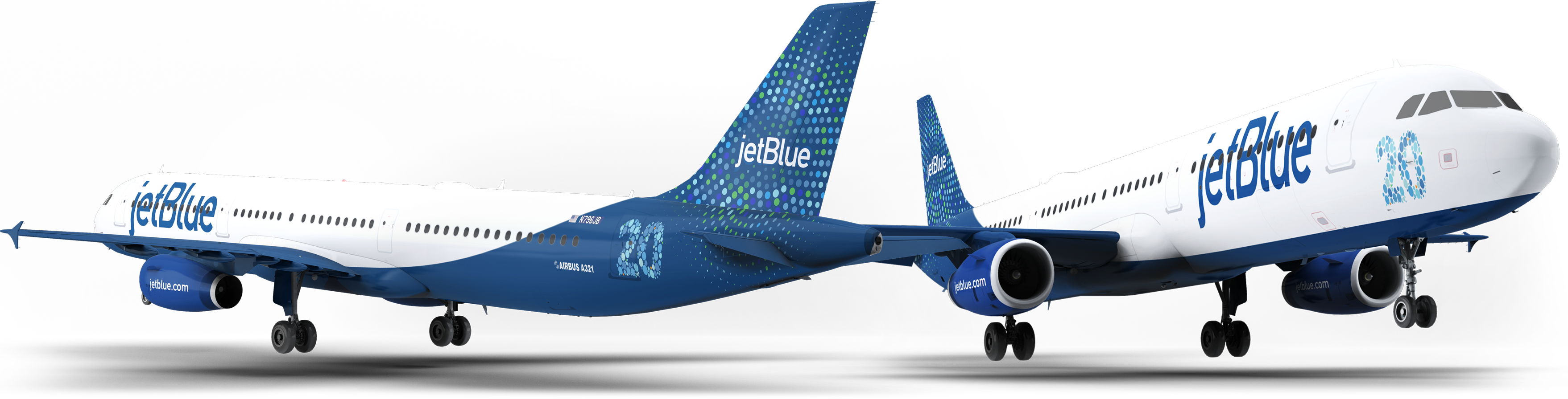
Airbus A321neo livery design
JetBlue launched into its 20s with an order of 23 new Airbus planes.
Aircraft livery design for this new fleet features the commemorative '20' at the front and back of the plane.
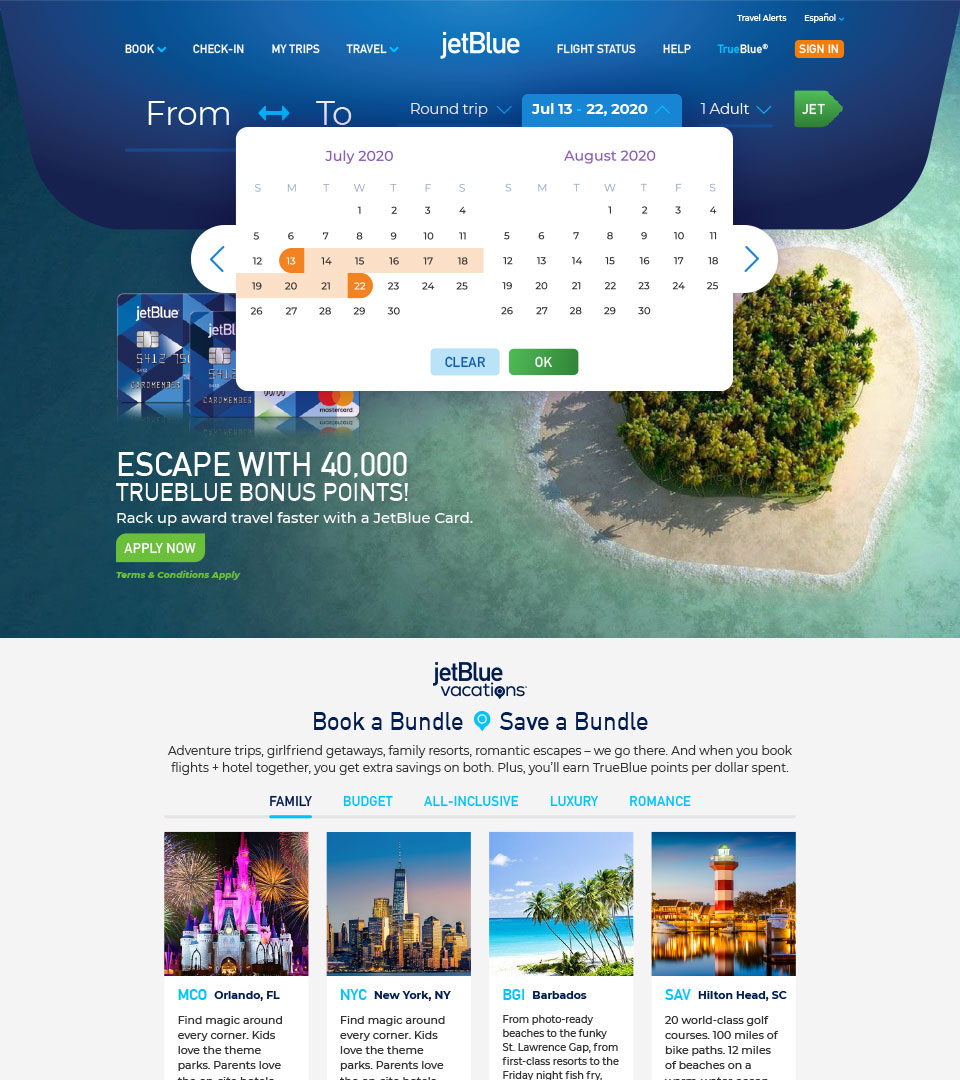
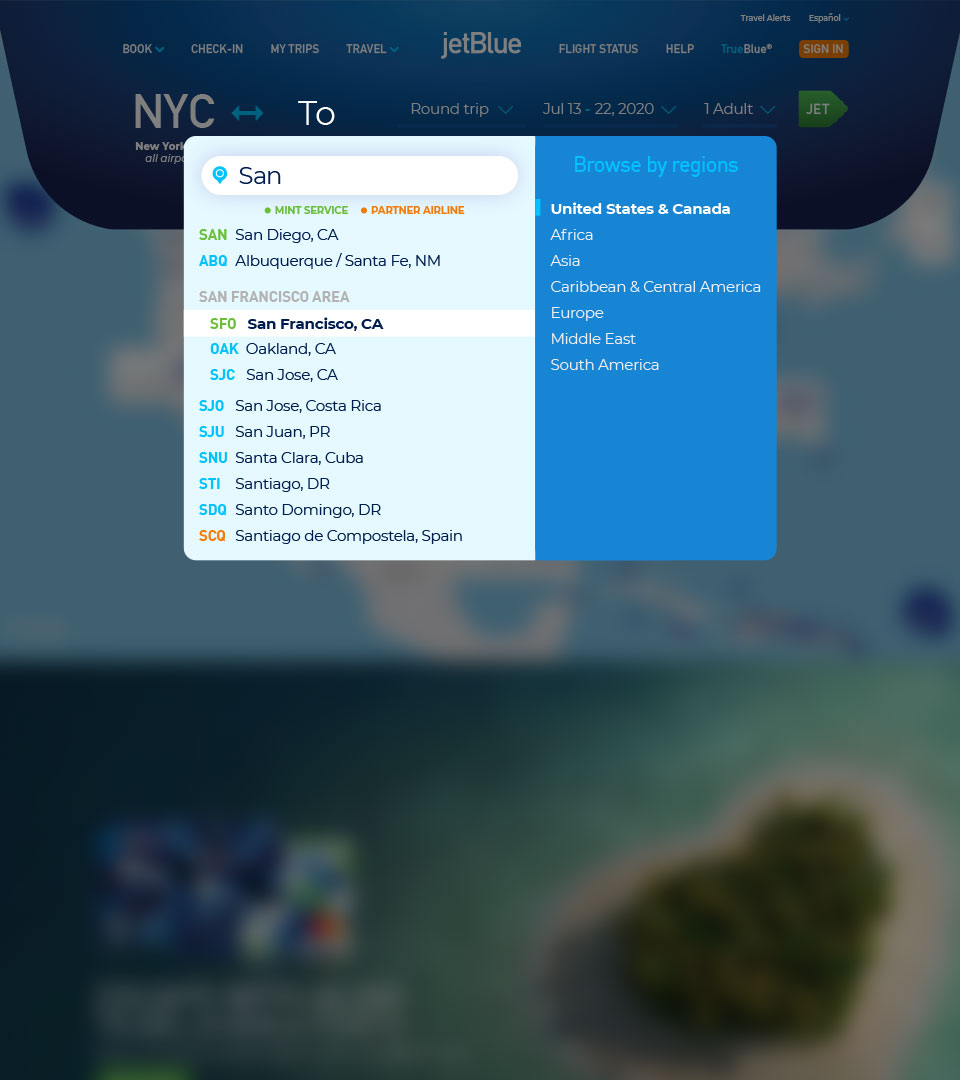
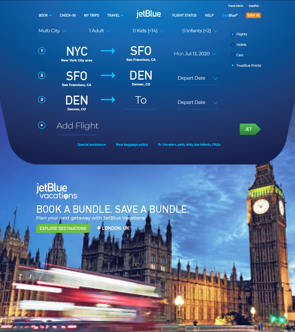
Streamlining the browsing experience
The disjointed reservation process on JetBlue.com needed standardizing and simplifying. Redesigning the landing page as a staging area allows content to be tailored based on each step of the user experience, including fuller visiblility on fare options across the network which invites customers to browse more confidently.